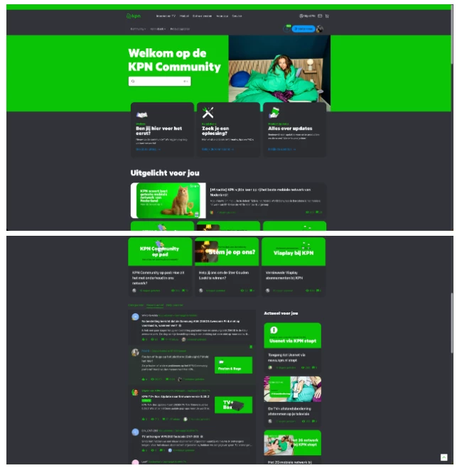
Some of our users have requested an option to switch the community itself to a Dark Mode. Most of these users enjoy listening to music on Deezer Web or via our desktop app, at night - and flicking a switch to make the colours of the community dark, would be a good addition
I’d also like to chip in here.
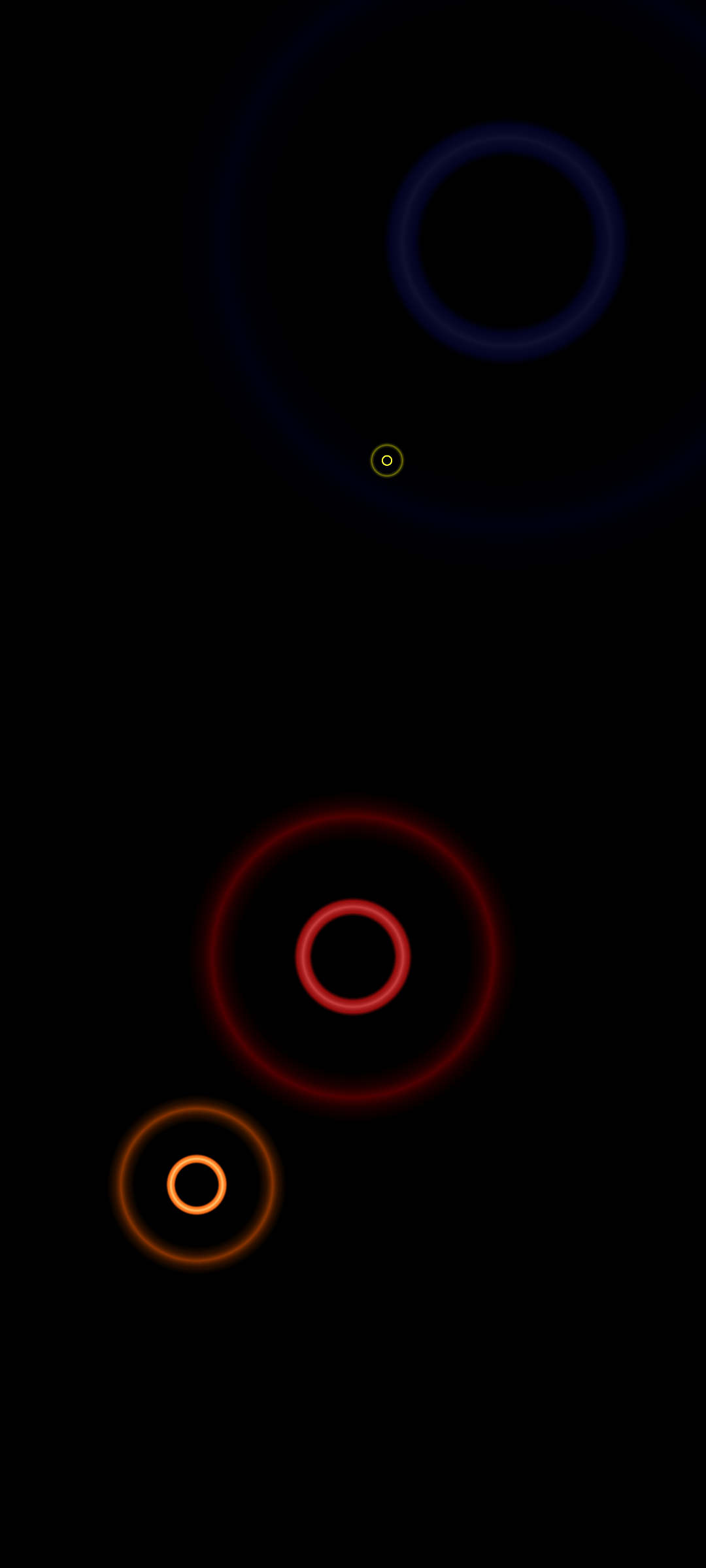
What would be even more epic, would be support for an optional AMOLED Dark Mode as well, for those users who really want to push dark themes to the extreme. Like this example
When used wisely, it can really make the other colours pop and can look absolutely amazing.
This, but applied to the inSided view as well please. My eyes will thank you :)
+1 for dark mode please! On both the moderation overview and the front end. My, and many other pairs of eyes, would thank you
Great idea! Many of our users ask about this feature.
Plus from me!
One dark mode please.
It is much better for your eyes, saves battery from your mobile device and just like mentioned - it looks much better. If possible give users option to choose, use or not.
Any updates about this idea?
Dark mode would be much appreciated in our community aswell!
+1 for this idea!
inSided, any updates please?
Hi
Unfortunately this hasn’t made it onto our current roadmap. We’ll be sure to keep you updated if anything changes here.
Hi
Unfortunately this hasn’t made it onto our current roadmap. We’ll be sure to keep you updated if anything changes here.
Hello Oliver,
are there any news about dark mode/dark theme?
Our devs love dark mode and and many other colleagues use it a lot, so it would be useful for our community as well (our CI includes bright colors)
Thanks,
Eva
Hi
This still hasn’t made it onto our roadmap, so no news here I’m afraid. I would personally love to see this idea implemented as I have a preference for dark mode as well. However, our Product team has prioritised other cool functionalities that you can check in the roadmap update below:
HI
Hi
No this hasn’t made it onto the roadmap yet. I recognise it’s a popular idea but our Product team have decided to prioritise other elements of the front end in order to modernise the user experience, including a notification centre, multi-language capabilities, user-based personalisation of widgets (to name just a few!).
Hey everyone,
I just created an article about this, please check it out and share your thoughts.
Thanks
Sign up
If you ever had a profile with us, there's no need to create another one.
Don't worry if your email address has since changed, or you can't remember your login, just let us know at community@gainsight.com and we'll help you get started from where you left.
Else, please continue with the registration below.
Welcome to the Gainsight Community
Enter your E-mail address. We'll send you an e-mail with instructions to reset your password.