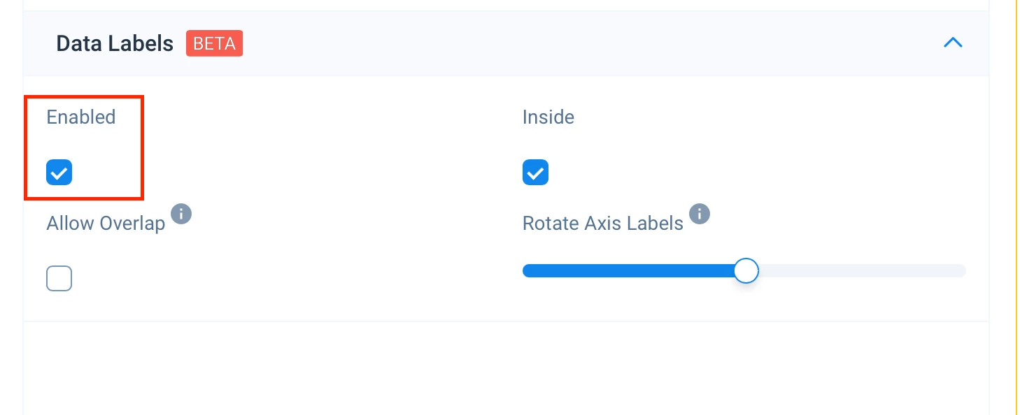
When building a bubble map report (or probably any report), it would be nice to be able to select which field the data label enables. Currently, it appears to default to a specific “Show Me” field - it looks like the field not associated with an axis - which isn’t really relevant/beneficial in some use cases.
The ability to switch this level to any field would be helpful. A use case would be on a bubble map report, you put the customer name in the “Group By” field and would prefer to enable the customer name label.