
There are a number of posts out there about unused white space and/or truncated field views, but I want to call specific attention to the Customer Portfolio widget.
As an admin, all the backend areas where white space and/or truncated field views are incredibly frustrating - but it’s especially frustrating in front-end areas for end users.
The Customer Portfolio widget in particular is frustrating
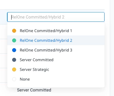
Below, I’m showing a CP widget with only four columns and the Service Delivery Tier field still doesn’t show the full contents - and when you hover over it is it at least 3 seconds before the actual value appears. Of course I would normally have more columns than this, but just making a point of how ridiculous this truncation is. Columns in this widget (and in all tablular reports) should dynamically expand to show the full contents without having to hover - the exception being Rich Text fields that may contain a lot of data.
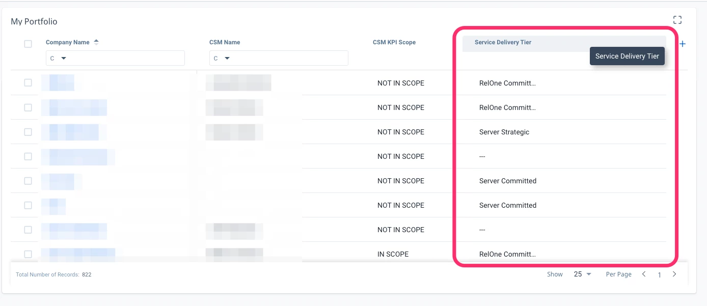
Customer Portfolio is the only place we currently have where end users can make in-line dashboard edits, so they use this a lot. PLEASE address this ASAP and make it easier for end users to make quick assessments of the data without the added effort.
