
Hi everyone,

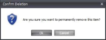
I have noticed that the delete buttons in a group are dangerously close to the save buttons. If you click “delete group” or even “delete post” there is no safeguard popup ensuring that you meant to click that. Please add this to your feature updates!

Here is a sample of what I am talking about:


Thank you @marissa.piazza for posting this idea!

We will open it for votes. In the meantime, I would like to ask besides the ‘Delete group’ button which buttons do you see as high risk and/or irreversible that would need this treatment? I’m not sure which one do you mean by ‘Delete post’.


Updated idea status NewOpen

@Ati Somos “delete group” is the biggest issue for me--especially because of the placement on the page next to the save button.