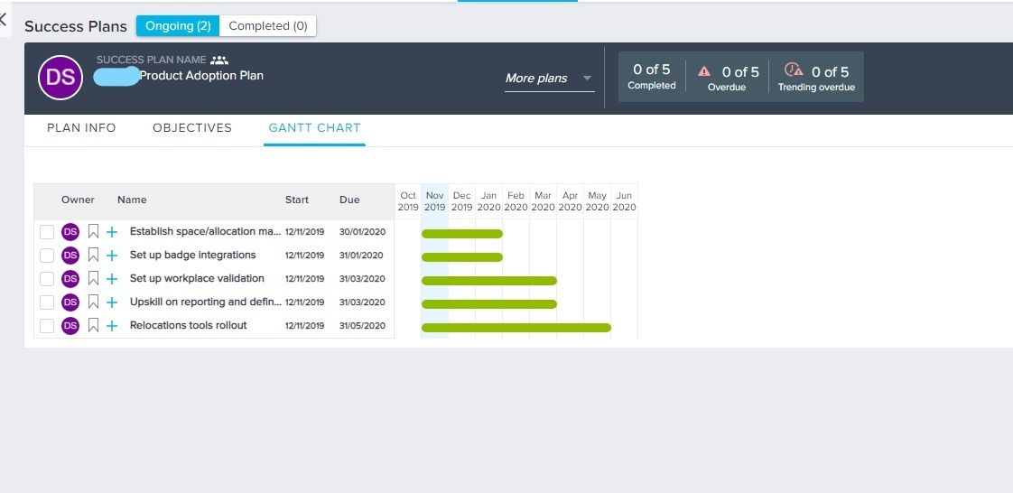
In Success Plans > Gantt Charts, I have a hard time with the readability of information. It would be a great resource for sharing and talking to the client, but I can’t adjust the chart so that my objectives and tasks are readable.

If the chart had a dynamic width, when I shift to the shorter month view, it could widen to fit my browser so that my objectives/tasks weren’t cut off. I could also zoom in/out in browser to be able to view all of the text. The alternative or other improvement would be to make the width editable, so that I could drag the Name column to be wider.

