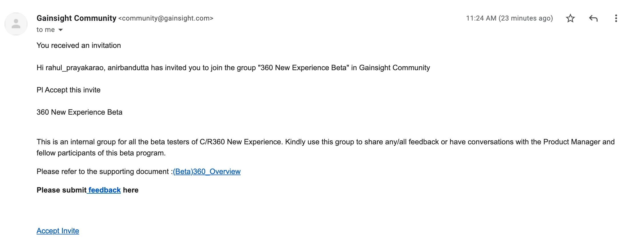
Just a UI feedback that The most imp CTA on the Invite email is the ‘Accept invite’ link that should standout and be at the top rather than at the very bottom.
The lossy scenario becomes more acute if the group has an extensive About section which appears on the body and the Accept invite is way below. I’ve had users have to re-check multiple times because they failed to spot the ‘Accept invite’ link and couldnt get inside a hidden group..


