"Holy Shit" Prevention! Enable Scaling of Vertical Axis in Usage Adoption Graph
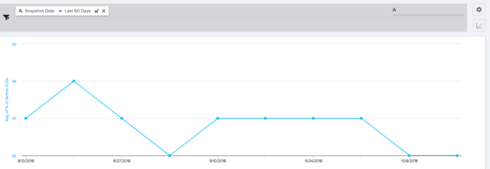
When our executives first see the graph of user adoption over time in the Usage tile in the Customer 360 view, they sometimes fall out of their chair when they see a curve that shows a large decline. Fortunately, most of the time this does not indicate a major drop in usage, just an inappropriate scaling of the vertical axis. For example, if we have 10,000 users, and the scale begins at 9,997 and goes to 10,001, then an inconsequential drop from 10,000 to 9,998 (or 0.2%) looks like they're falling off a cliff. We would like to have the option of forcing the vertical scale to start at zero, as well as the flexibility to customize the scale to other ranges.

Sign up
If you ever had a profile with us, there's no need to create another one.
Don't worry if your email address has since changed, or you can't remember your login, just let us know at community@gainsight.com and we'll help you get started from where you left.
Else, please continue with the registration below.
Welcome to the Gainsight Community
Enter your E-mail address. We'll send you an e-mail with instructions to reset your password.