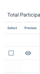
I’m not so happy with some of the recent update to the Surveys 2.0 Enhanced Survey Participants change under the Analyze tab. Previously, the page had icons in the first column that allowed me to easily preview the response, which I used all of the time.
Now the preview moved to the dropdown menu on the far right of the screen, and instead the left-most column has check boxes for each survey and allows me to delete a bunch of surveys at one time. Now, that might be a useful function, but I almost NEVER delete survey responses, and I would hope no one does.
So, instead of one click on the left side (typically where my mouse starts out on the page) to preview the response - the action that I do ALL THE TIME on the screen, I now have to navigate to the far right, hoping that I am still on the correct row, click the vertical ellipse, then choose preview - a mouse drag and 2 clicks to perform a very common action that used to take just 1 click.
I don't think that is a positive "enhancement" to the system. Please change it back.


