
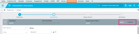
Regarding Rules Engine Task creation UI

  • September 6, 2017
  • 9 replies
  • 5 views

mayuram_borthakur
In the Setup Rule UI, once the initial Dataset task is saved, to add one more task to the rule the user needs to click Cancel, which is weird. Cancel should generally be used to cancel an action rather than creating a new one. We should have a different UI label here. Can this behavior be changed for better usability?

9 replies

jitin_mehndiratta
Hi Mayuram,

To add another task, the user can click on "<--" button next to task name. Although Cancel does the same, but the purpose of cancel is to get rid of any unsaved changes. We can definitely think of a better UI. Thanks for bringing it to our notice.

Thanks,
Jitin

mayuram_borthakur
  • Author
  • Contributor ⭐️⭐️
  • September 6, 2017
Thank you, Jitin.

srinivas_muthyam
Mayuram & Jitin,

We could probably add another action button that let the user takes to adding another task. Let us know!

One of the reasons why we probably went with current placement is to give the user enough space to see the maximum current tasks details. Instead of having a add task button on the top of the task header(Above the name description bar).

mayuram_borthakur
  • Author
  • Contributor ⭐️⭐️
  • September 6, 2017
My vote is to have another action button to make it intuitive. But, if it reduces the real estate considerably, we can live with the current UI arrangement. 

Thanks!

jitin_mehndiratta
Current design lets the user see how the dataset task is related to the previous task(s). Eg. Assuming that i create a merge task. Before creating any other task, the user today sees a graphical representation of which 2 datasets are merged to form this task. Having an action button on this screen to add another task may not be a good idea because of this reason. Just one thought.

mayuram_borthakur
  • Author
  • Contributor ⭐️⭐️
  • September 6, 2017
We should keep the graphical representation page intact. We can probably, add a button in the previous page, which can be something like - "More Task". When we click on More Task, we are navigated to the graphical representation page, which remains the same. The user has to still click +TASK to actually create the task. In this case,  "More Task" will not be an action button as such, it will just navigate you to the page where the action should be performed. We can think of a better name. Let me know if this approach works. Thanks!

devin_stevens
Forum|alt.badge.img
  • Helper ⭐️
  • September 6, 2017
What about a "save & close" button? Most users will save when they have completed the task, but clicking save AND then having to click back makes it feel unnatural.
I agree on navigating user back to the rule overview with flowchart.

dan_ahrens
Forum|alt.badge.img+2
  • Expert ⭐️⭐️⭐️
  • September 7, 2017
I like Devin's suggestion here. With the data complexity potential, going back to the data flow is a good idea, but with a slight wording change to make it more consistent/intuitive. 

srinivas_muthyam
Devin's suggestion is a good idea and we will try to incorporate the same. Let us know!