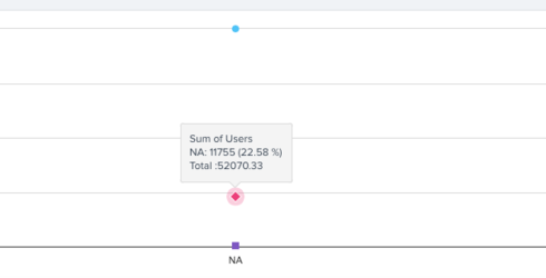
If we create a report with a chart that has "Show data points" or "Show percentage" turned on, the values are displayed with a bold style. This causes the values to be wider and less readable. Someone wise once said, "if everything is bold, nothing stands out".
Could data points and percentages be displayed using a regular font (or give the admin some control over the styling)?
Reporting for charts - turn off bold font
Sign up
If you ever had a profile with us, there's no need to create another one.
Don't worry if your email address has since changed, or you can't remember your login, just let us know at community@gainsight.com and we'll help you get started from where you left.
Else, please continue with the registration below.
Welcome to the Gainsight Community
Enter your E-mail address. We'll send you an e-mail with instructions to reset your password.