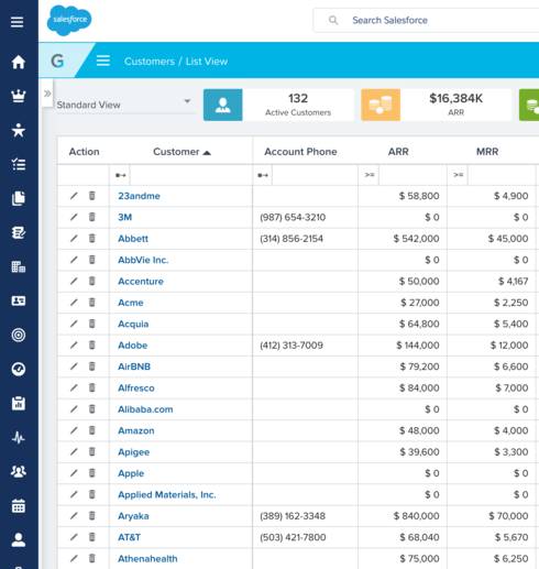
Suggestion: Darker text on Customers Tab

I've gotten feedback from our CSMs that the light blue text that links to an account on the Customers tab is hard to read. I think darker text here would help it stand out against the light background and it would be easier to read.

Sign up
If you ever had a profile with us, there's no need to create another one.
Don't worry if your email address has since changed, or you can't remember your login, just let us know at community@gainsight.com and we'll help you get started from where you left.
Else, please continue with the registration below.
Welcome to the Gainsight Community
Enter your E-mail address. We'll send you an e-mail with instructions to reset your password.