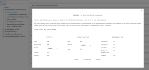
Vault assets preview requires too much scrolling

  • March 10, 2016
  • 4 replies
  • 0 views

lila_meyer
Forum|alt.badge.img+5
When a user previews a Survey or Playbook or Email template asset, they have to scroll through the pop-up window to view more than 1 or 2 questions, or more than 3 Playbook tasks, etc. 

Customers have complained about our poor use of space in Cockpit > Playbooks when they're viewing the associated tasks, but it seems like we've introduced the same minor annoyance with Vault assets. In Surveys and Playbooks, the limited view makes it a little unclear that more tasks or questions even exist in the asset. 

4 replies

gaurav_kotak
  • Expert ⭐️
  • March 10, 2016
Is the scrolling itself an issue, or scrolling in a popup? BTW, there is an updates UI coming out in May or July, but there will still be some scrolling. Connect with Praneet for more details. 

lila_meyer
Forum|alt.badge.img+5
  • Author
  • Gainsight Employee ⭐️⭐️⭐️
  • March 10, 2016
When you first preview the asset, the scroll bar is not visible. It's invisible until you actually move your mouse within the pop-up area. I would like to be able to re-size the pop-up to see all of the asset's contents, or even a message that briefly displays saying "Scroll to view additional content," might be helpful.

praneet
  • Helper ⭐️⭐️⭐️
  • March 11, 2016
Hi Lila,
Thanks for feedback, I will incorporate these feedbacks in UI revamp for Vault, that is coming in May.

spencer_engel
Forum|alt.badge.img+5
From what I can tell, the scrolling is still an issue. One of our customers tried to download an asset yesterday from Vault and was confused when he thought he had mapped everything he needed to under the "Configure" step. Once I screen-shared with him, we determined he merely needed to scroll down to map the final piece of info in order to download it. I could see where this would be frustrating for customers though since there is no scroll bar. (screenshot included)