Hi
Anyone have any idea how chart colors can be changed when charts are created in Reports 2.0 using MDA data?
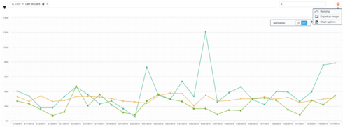
More like is this even possible? Mainly because below you can see the two Green colors are almost so similar its confusing to which metrics this is referring to.
Page 1 / 1
Hi,
Ability to change colors in a graph is in our roadmap. Actual timing is TBD.
Thanks,
Sumesh
Ability to change colors in a graph is in our roadmap. Actual timing is TBD.
Thanks,
Sumesh
I concur. Having a choice of colors would be a substantial win. As Naquiyah points out, the colors can occasionally be close in hue. Also, there are times I want to chart items which might be perceived as negative (number of errors my SaaS platform issued, which might be red) vs positive (number of clicks on a new feature, which might be green). Having the ability to select colors clarifies that story whereas now my lines are whatever color Gainsight selects for me.
+1
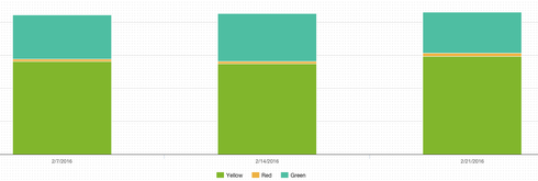
This is become needed more and more for us. As you can see from the screenshot below, none of the colors are correct and can be misleading to those who are not aware of the issue with not being able to select the correct color. Please expedite this functionality.
agree
Hello Everyone,
Ability to change colors is tentatively targeted for May release.
Thanks!
Ability to change colors is tentatively targeted for May release.
Thanks!
Reply
Sign up
If you ever had a profile with us, there's no need to create another one.
Don't worry if your email address has since changed, or you can't remember your login, just let us know at community@gainsight.com and we'll help you get started from where you left.
Else, please continue with the registration below.
Welcome to the Gainsight Community
Enter your E-mail address. We'll send you an e-mail with instructions to reset your password.

