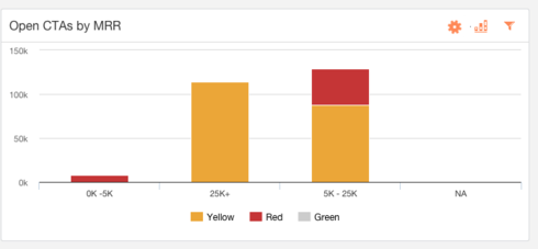
Below in the chart when I select Green I expect to see accounts that are categorized as green. Instead the UI removes the option I select. Hmmm this seems a little (sorry oddly) off!
This would be a great and I assume easy enhancement where a user selects what they want to see not select what they dont want to see!
Naquiyah
Page 1 / 1
Since they all start as "On", I think of clicking as turning them "Off". I think the other way may be more problematic as the system is guessing what to do with the other two selections. Especially in a use case where you want to see both Yellow and Green. Make sense?
Reply
Sign up
If you ever had a profile with us, there's no need to create another one.
Don't worry if your email address has since changed, or you can't remember your login, just let us know at community@gainsight.com and we'll help you get started from where you left.
Else, please continue with the registration below.
Welcome to the Gainsight Community
Enter your E-mail address. We'll send you an e-mail with instructions to reset your password.
