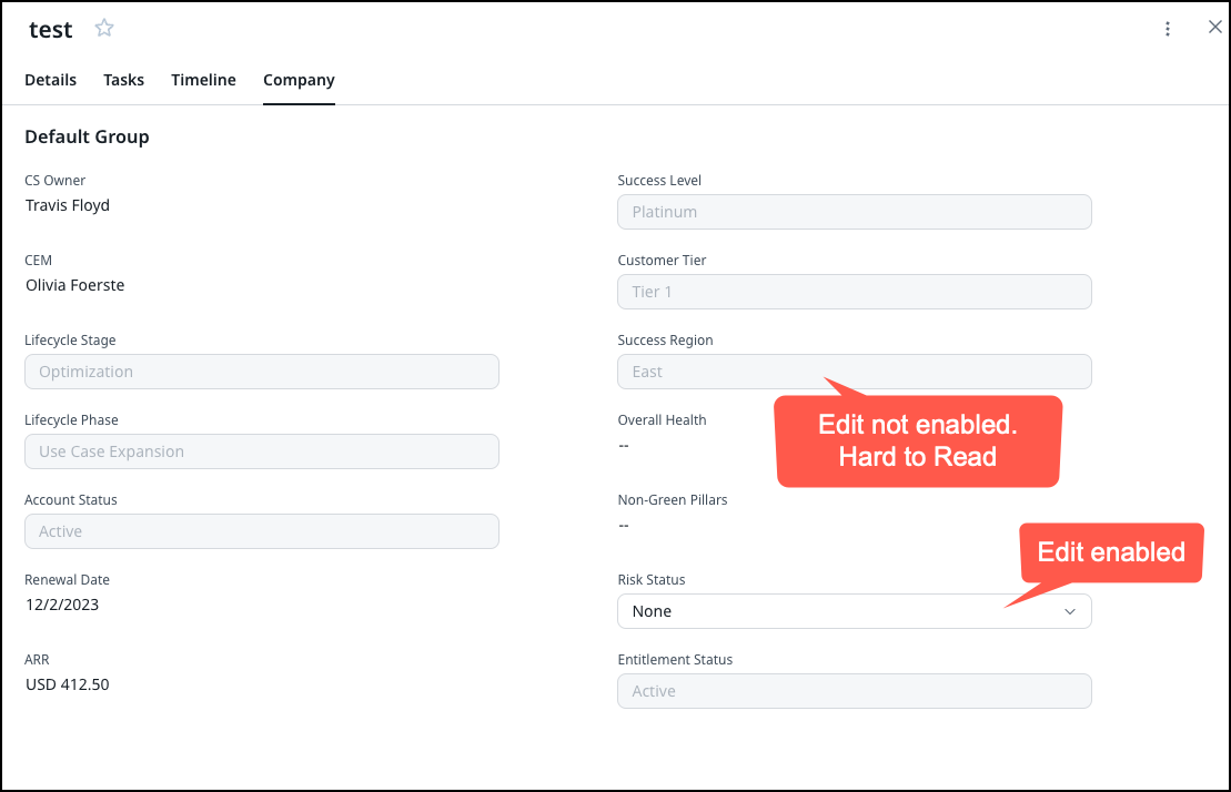
When adding informational Pick-List fields for CTAs where the EDIT option is turned off, specifically on the Company Tab in my case, but could be on other tabs, the resulting view is VERY hard to read. Gray on Gray for the fields. I get setting the background to Gray when it can’t be edited, but the TEXT needs to be black.
Definitely need to make #accessibility considerations!
There’s a post somewhere I think I made about making it easier to see the difference between editable and non-editable fields, but this is really not helpful. Not useful design if you can tell what is editable and not, but you can’t READ anything.