Hi @DannyPancratz, thanks for the idea! Was about to merge this idea with the one below, which has already got 22 votes, but I’m curious to learn from your side where you think they differ and are similar.
https://communities.gainsight.com/ideation/show?id=19276&title=superseding-badges
There are many gamification examples in gaming where the user gets to pick 3 badges to showcase in their profile. Off the top of my head and on my phone: Monster Hunter Now! as an example.
Absolutely agreed!
We’re exploring community right now, but I’d expect a lot of our badges would be around training (completed a certified user program), champion user groups, spoke at one of our events, etc. -- possibly more than “completed a quick course.”
This is my next project. hardest thing is designing the badge style so I can quickly create a ton of badges that look good alone and together.
@Sebastian back from leave so I can answer your question.
I think the superseding badges idea is a good one and added my vote. I’ve found ways to do this on my own using the API, but ran into some issues with some of the automation based on specific activities, so it would definitely be great to do.
However, I still see this as a separate and additional need.
Example 1: Your top users are the ones most likely to have the most badges. They’re also the users most likely to have some of your exclusive badges for super users, etc.
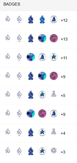
If a user is a superuser, advocate, or expert in a specific area, they probably earned those badges later in their user journey. Therefore the badges will be in the middle or towards the end of their badge showcase.
Badge hierarchy would allow you to showcase the most relevant and significant badges first. (Sure, we have Ranks and Rank icons as well. But Ranks are limited to 1, whereas badges are multiple. I have a number of users who are SMEs, Certified at a top level, and earned other badges based on the quality of their answers/content. A rank doesn’t really work for that.)
Example 2: Gamified Onboarding
(While I don’t personally like it...) badges for onboarding milestones are a common use case often recommended. For example, someone introduces themselves in the welcome forum, or someone asks their first question, provides their first answer, etc.
In this scenario, most users’ first badge(s) will be the same badge(s) earned in user onboarding. Thus, most users’ badge listings will all begin with the same badge(s). Eventually it becomes visual noise.
TL;DR Hierarchy helps organize the information to the put the most relevant/impactful badges first. Supderseding badges help reduce clutter and aid in solving the problem, but they don’t solve the same problem.
Look no further than my profile. My first badge shows that I attended 2023 pulse (not super helpful). And my GameChanger Award is in lost in the middle.
(although are you working on this?? on the leaderboard and hover preview it’s in the middle, but on my profile page the GameChanger Award is first )
Adding to this idea - we would like to see badges displayed with the most recent earned listed first. That way the “advanced” badges that we award manually are listed first rather than the first ones earned.
@beatriz.winn for vis.
We absolutely need to be able to set a hierarchy for badges (just like ranks).