
Let me preface this by saying that I like the cleaner/minimalistic look of the new UI. However, I have some feedback related to both the Admin and End user experience.
I created a clone to test some layout changes.
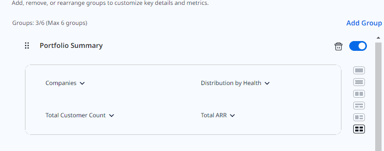
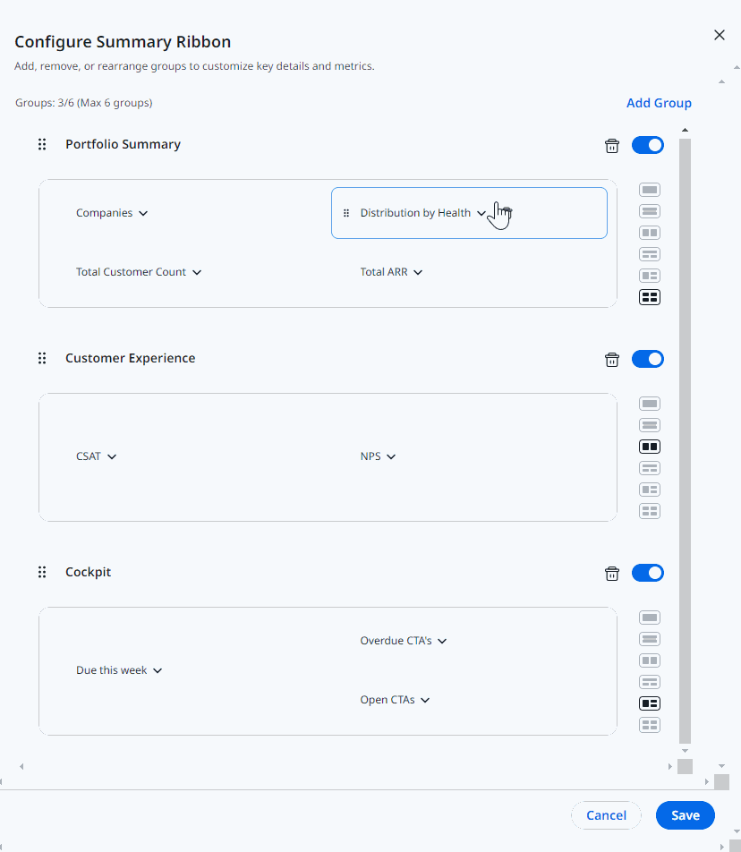
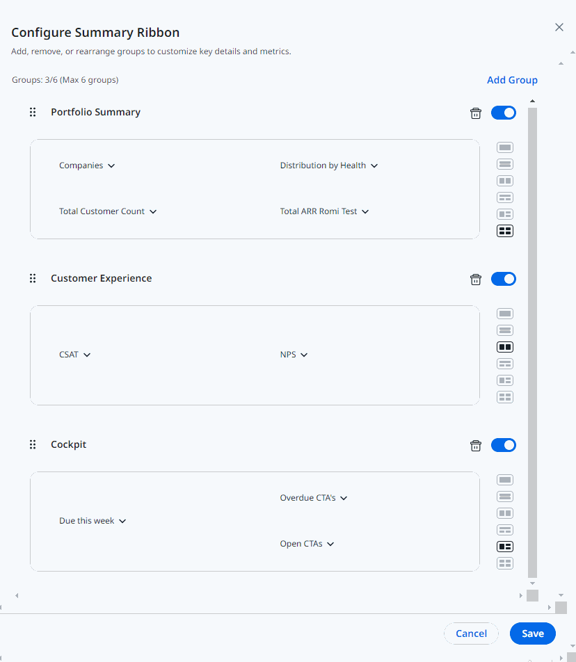
In the Portfolio Summary I have 4 reports:
Companies, Distribution by Health (these two are OOTB), and two custom: Total Customer Count, Total ARR. I want to change it to 3 reports: Total Customers big at the left, Distribution by Health at the right and Total ARR below it. If I delete Companies, change to a 3-report layout will default to show the Add Attribute/Report instead of rearranging the 3 that I already have. I didn't expect that.
Ask #1: If there is already a "blank" do not prioritize it when changing the layout to one with fewer reports. If I delete two and change to a two report layout, I'll expect those two to be shown. I understand there are implications if the user has 3 reports and changes to a 2 report layout, but I would think that at least the "chosen" will take precedence over a blank space.
After, I tried rearranging the reports to leave Companies in the right-bottom position as this is the report that gets dropped when changing from the 4 to 3 report layout. Such a mistake thinking that drag and drop will swap the reports!
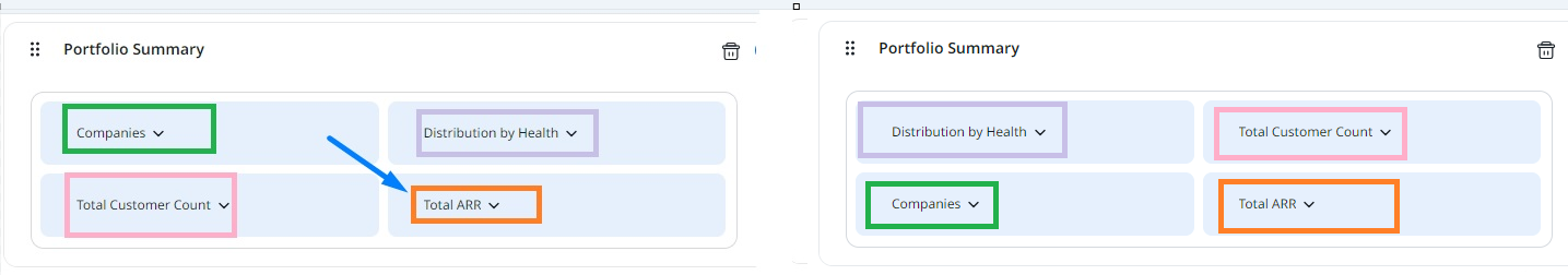
The mental gymnastics to make this work caused me a headache and for a moment I thought I had figured it out, but the behaviour wasn’t consistent… I don’t know in which specific pixel I am supposed to drop the element to get always the same output 😖
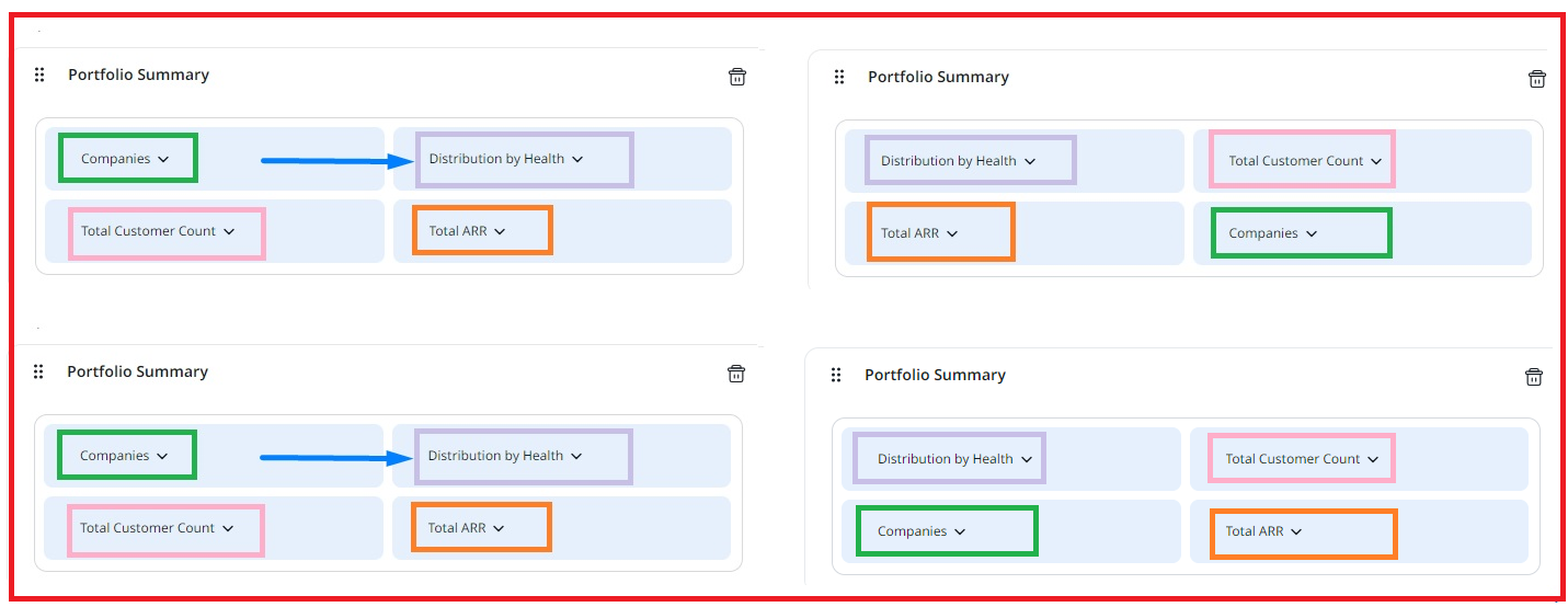
Ask #2: In this reduced space is waaay easier for an end user to swap things (if I move piece A on top of piece B, A will take B's place and B will take A's) than whatever is happening now.
It takes much less time and effort to go to a 3-report layout and reconfigure everything from scratch than trying to figure out how to reorganize them, even considering that the customized reports sourced from Company default to Parent Company as identifier instead of GSID so you can easily fall into the trap of not having the correct GSID configured.
Ask #3: If Company is the report’s source, use the Company GSID as default. Maybe I’m blind to other user needs (eg, we don’t have relationships) so I'm not sure if there is a scenario where this would not be the expected default value. I'm eager to hear other admins' feedback.
Ask #4: I feel again this is just a matter of making the UI prettier but ignoring the UX… Why prioritizing looks over functionality? Filtered data spaces are still not supported and the oldest idea I can find about that is almost 3 years old, and there are newer ones with the same ask:
Now, moving to the End-user interface.
We noticed that the global filter applied sticks, so the next time the user lands in Home the filters are remembered. I'm not against this, there are instances where this is a time saver.
However, now the global filter is collapsed by default which makes this stickiness a potential problem because it's not obvious which data is being shown. Additionally, this is a different behaviour than Dashboards, where the global filter bar is always visible.

Ask #5: Do not collapse the global filter bar. Be consistent across features.
Thank you,
