Another in a theme of Ideas posted here about the Horizon UI and it’s limited visibility in its “working areas” compared to the unutilized nearby white space.
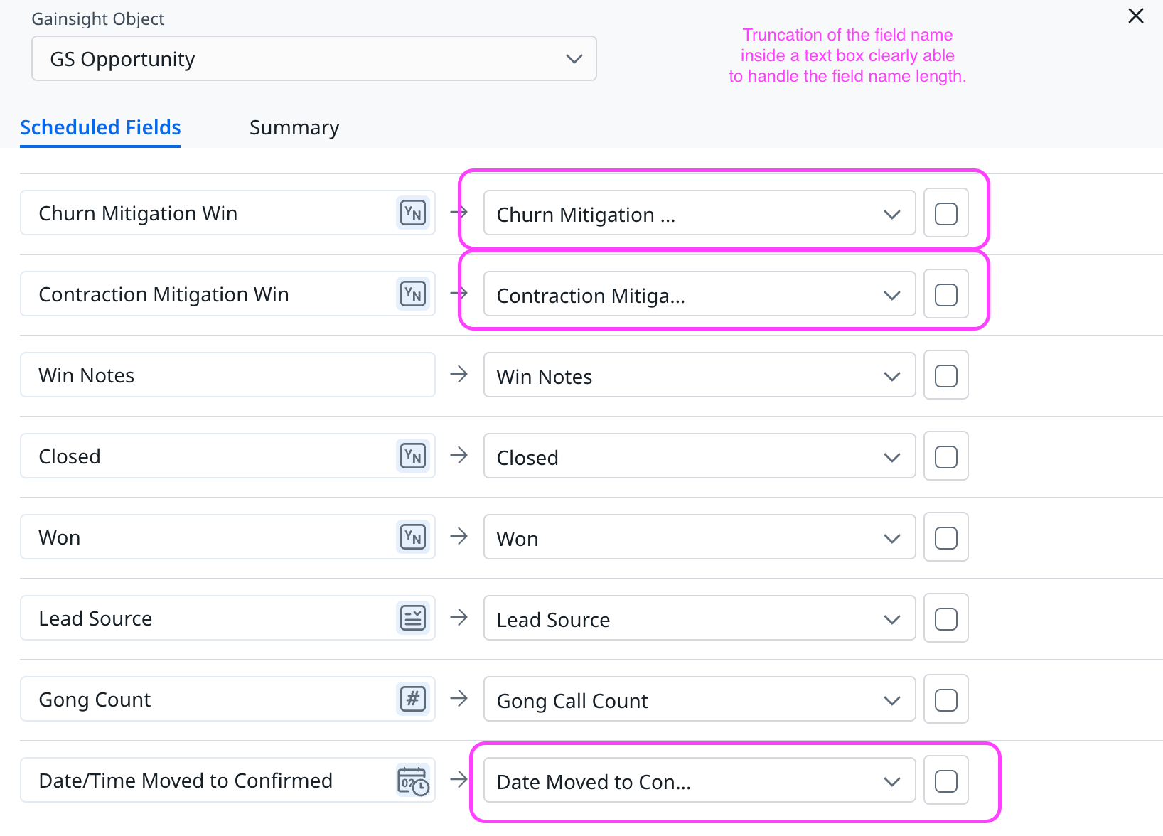
In the Rules Engine > Action, the target field name is very limited. In my example, it’s not so bad. But once you’re loading to many target fields, especially where they have similar names, the truncation of the target field name is a blocker.
Yes, the visibility of the target field name is responsive, in minimal ways, to a larger window and larger screen. However, one must have a impossibly large monitor and window to improve the visibility of field names in an example like this.
Yes, one can also hover to see the full field name. However, that’s time consuming and clunky, especially when loading many fields.
In both work-arounds above, we’ve taken an “Admin Quality of Life” step backwards from Bionic rules, where these limitations do not slow an admin’s work.
So much unused white space all over the application
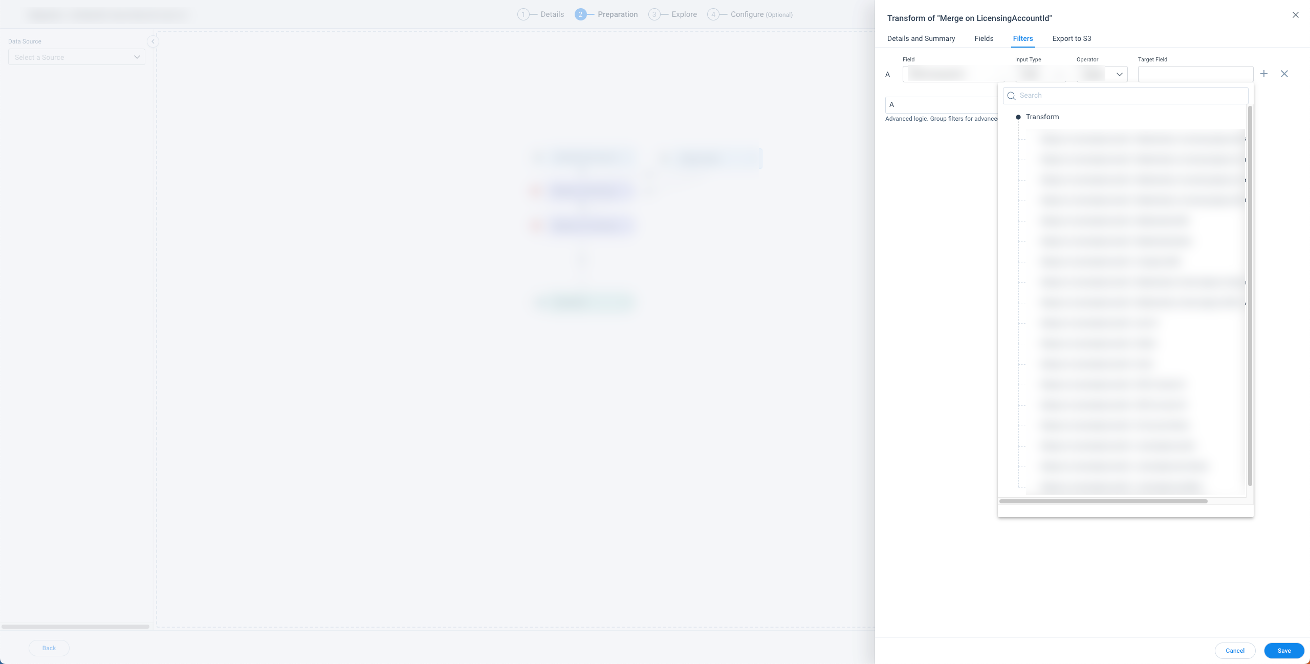
Adding this screenshot as a different part of the horizon UI where whitespace could be utilized more efficiently; this screenshot could be either rules or DD but the issue is the same, the edit modal is on the right side surrounded by lots of whitespace. The field dropdown doesn’t resize based on field length and so becomes truncated giving the user a horizontal scrollbar. A better UX would be a dynamic resizing (within limits) based on field name length to not require a scroll.
I submitted a while ago an idea with Stuart’s example, and Sara had already submitted the same before then.
Whitespace is a pain point across the whole application :/
This…
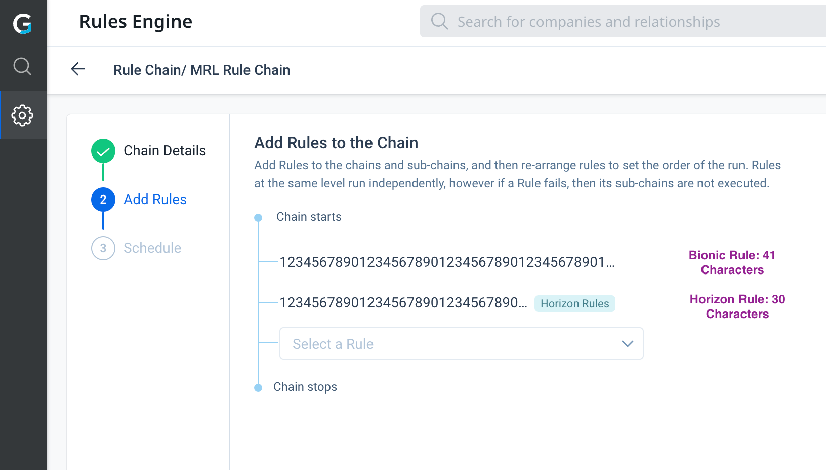
Adding this to the list of areas in the UI with white space unutilized - this is in Rule Chains. If I remember correctly, rule names by design can only contains 80 characters. Imo, it would make sense to allow the display on this page to show 80 characters of rule names, versus truncating.
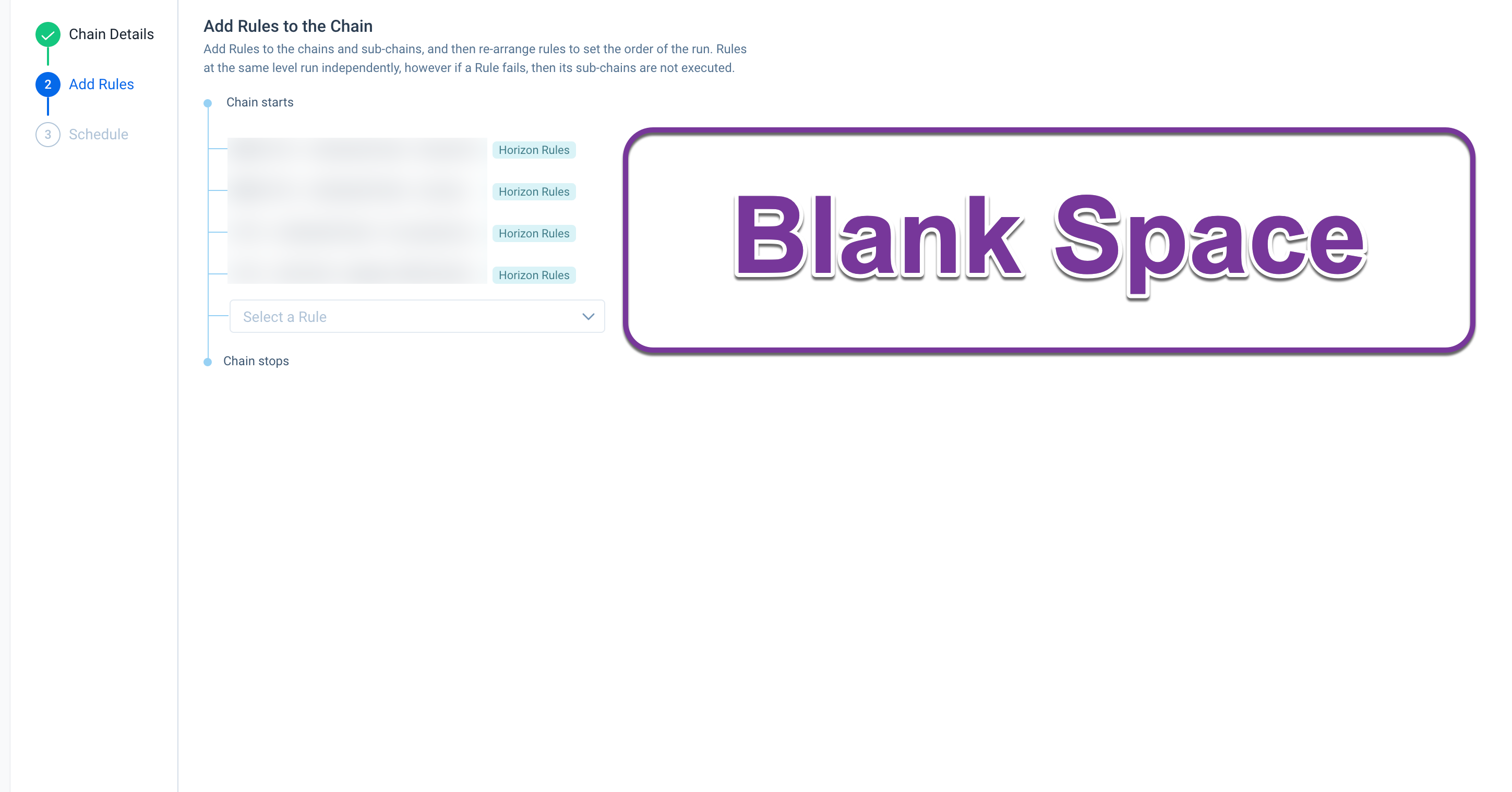
Even more interruptive, in the Rule Chain > Add rules view, the Horizon Rules tag consumes roughly 11 more characters. I am truly confused at how designs like this are getting into production.
The Customer Goal tab is another place where excess whitespace persists. For any goal names that are longer, they’re truncated. To see the full goal name, you have to either:
OR
All the votes have been transferred into this idea.
Here’s another example that leaves me frustrated with the Horizon UI.
The field name is truncated within a text box that is clearly large enough to handle it. Why use a design that puts white space inside a text box that definitely has room for more text?
Hello everyone
The Comments were on other threads on the topic but pl know that we are taking a look at addressing the excess white spaces issue across the various areas, addressed directly by@ophirsw
and@rakesh , here
In the mean time let us tag any whitespaces issues feedback with the keyword whitespace
To add to this, when building a query in JO, there is a lot of whitespace to the right of the filters. Looking at the far left of the image below highlighted in red, some of the fields seem to be impacted by the lack of space on this side of the UI; some of the data type icons are cut off, some are indented weirdly, and longer fields are cut off since they run out of space. Why not use the whitespace to let us expand the fields section at left so the above issues could be avoided? This truncating definitely makes it a bit challenging sometimes to see which fields we’re pulling into the Show section or Filters. Luckily there is a lot of whitespace to hopefully work with to improve this!
Created a separate (but related) post specifically for Customer Portfolio because, as frustrating as all this whitespace/truncated views is for admins in the backend areas, it’s even more frustrating for end users, and IMO we need them satiated first.
Here’s another Horizon UI issue.
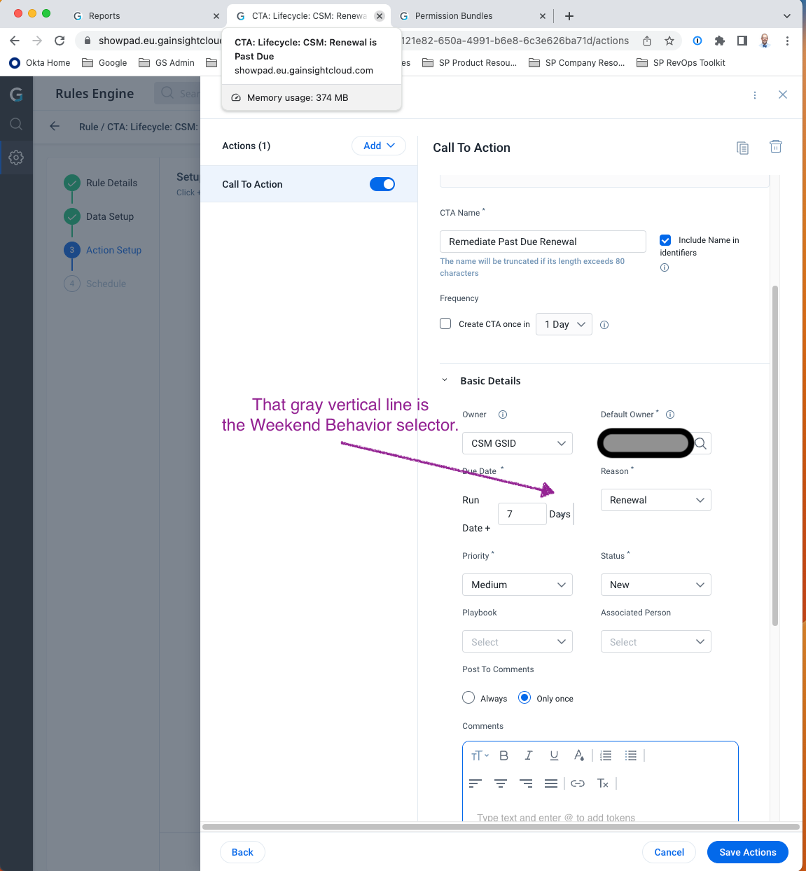
One the Rules Action page, the Weekend Behavior selector can almost disappear.
Granted, I was in a narrower-than-average web browser, but not an absurdly small window. When the new UI actually makes configuration harder, it’s not a great UI.
Here’s another Horizon UI issue.
One the Rules Action page, the Weekend Behavior selector can almost disappear.
Granted, I was in a narrower-than-average web browser, but not an absurdly small window. When the new UI actually makes configuration harder, it’s not a great UI.
<<Repeating comment because the screenshot didn’t render in the previous comment>>