

More Intuitive Replies: Hide replies box for posts with zero replies OR Add Reply button to post
We’ve received some user feedback that it was not intuitive where or how to reply, and had seen an abundance of users using Quote to initiate a reply even when quoting isn’t necessary.
My analysis is that the Reply (editor) box is often pushed “below the fold” and obscured by the 0 Replies box. Even with the “Be the first to reply” call to action, there’s not a clickable area that’s intuitive for the end user.
See image below. Reply option is not visible within the window.
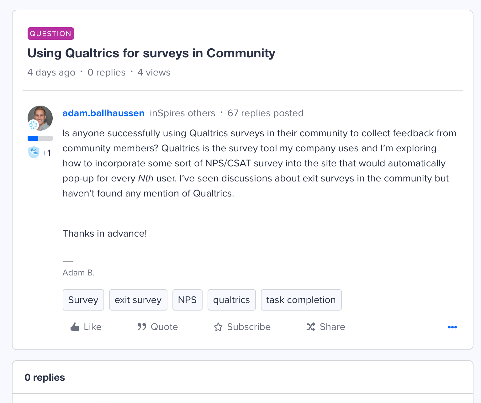
It seems that the 0 replies box is actually more of an X replies box that populates the reply feed on each post (and just displays a message when there are no replies. So it seems necessary to the architecture of each post that it goes:
- Post
- X Replies box
- Reply (draft/edit) box
My proposed solution is to introduce logic that hides the X Replies box for posts where Replies >1. That would move the reply editor higher in the page and introduce a more intuitive UX.
Alternatively, the most intuitive solution would be adding a reply option to the original post that’s similar to quote functionality: jump to the reply editor, just without the quote.
I’d personally recommend both.