Digital customer success is more than just creating automation or scalability. It's about creating personalized & unique experiences for your customers by leveraging the power of automation in a scalable fashion. In order to create a personalized experience, we need to first understand more information about our end-user roles and the goals they hope to achieve using your product or service.
Whilst this data can be defined by your customer success team manually, it is an ominous task and can be very difficult to maintain or get right. By leveraging the power of Gainsight PX, you have the opportunity to ask your customers for this information directly, both at the beginning of their journey and also at regular intervals. If done right, you will maintain an up-to-date record of their role and the goals they hope to achieve from using your product.
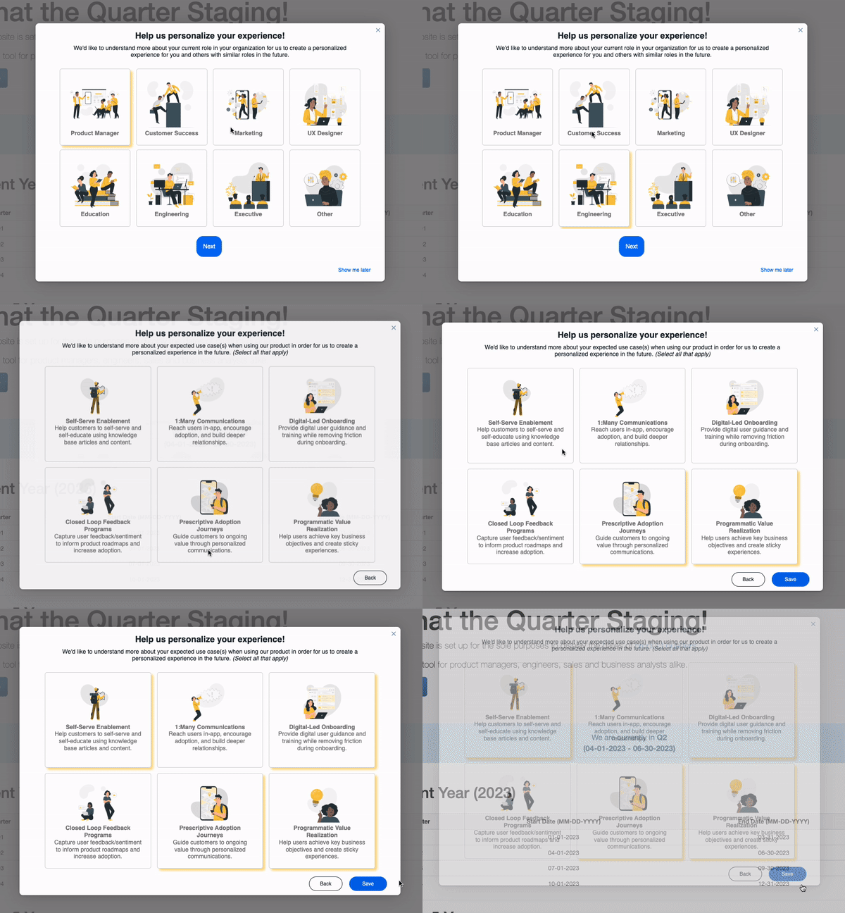
To achieve this, we at Gainsight, recently launched a new in-app engagement using Gainsight PX to ask our users directly.

How did we build this?
A while ago we released functionality into Gainsight PX which allows customers to update user attributes when an end-user clicks on a button. My colleague
Whilst the buttons are great, the issue our team had was that the experience didn’t match the high quality we aim for with our product (We wanted for it to have more branding). That’s why we began to look into how we can add images and formatted text to these buttons with some custom CSS and HTML. Here’s a code snippet if you’re interested:
| Warning: If you are stuck or unsure about editing HTML/CSS, please consult a developer who can assist accordingly. |
| Note: In order to replicate this, you will first need to insert a button into the desired location and define the action. The button ID is then unique for each button and will be used to register the action which it is going to take. It’s also important to note that once you adjust the HTML of the button itself if you later wish to change the button's action (i.e. - changing the user attribute that is updated using the menu), it will remove all of your customizations. |
        <p>
            <button id="pxCustomButton-XXX-XXX-XXX" style="
                padding-right: 16px;
                padding-top: 16px;
                padding-left: 16px;
                padding-bottom: 16px;
                border-radius: 4px;
                background-color: rgba(255, 255, 255, 1);
                color: #000000;
                font-size: 14px;
                font-family: Helvetica, Helvetica;
                font-style: unset;
                font-weight: unset;
                text-decoration: none;
                border-style: solid;
                border-width: 1px;
                border-color: #e4e4e4;
                cursor: pointer;
                display: inline-block;
            ">
                <img src="https://www.gainsight.com/wp-content/uploads/2022/08/gainsight-customer_experience-1.png" width="200" height="43">
                <br><br>

                <strong>Customer Success</strong>
                <br>
                You maintain a book of business

            </button>
        </p>
Image
One of the challenges we faced by using this method is that it didn’t give our users any feedback that their responses had been recorded. We did look at applying some additional CSS once the button is clicked but if the user changed their mind, it will show all of the buttons previously selected as having been recorded (which is incorrect and could be confusing).
That’s why we went back to the drawing board. We thought about what experience we want for the customer to receive, and how it should be displayed and the thought which kept coming to mind was a survey-like form.
By using an HTML element called Radio buttons, it allows users to select only one option at a time - the challenge is however that a Radio button has a limited appearance. That’s when we thought to make use of labels as well. We would create a radio button, hide it from view, and use a label as a way to represent the image - making it look like a native button, similar to the example above.
The next challenge would be getting the data recorded into the user's attributes within Gainsight PX. For this, we turned to Javascript and by leveraging Gainsight PX’s Web SDK we were able to update user attributes with an “onclick” action within the HTML code.
Here’s a code snippet of how it looks:
| Warning: If you are stuck or unsure about editing HTML/JS/CSS, please consult a developer who can assist accordingly. |
HTML / JS
<form>
    <p style="text-align: center;">

            <input type="radio" class="buttonradio" id="role1" name="radiobutton">
            <label for="role1" class="buttonradio-label" onclick="aptrinsic('set', 'user', { 'role': 'Product Manager' });">

                <img src="https://www.gainsight.com/wp-content/uploads/2022/08/gainsight-customer_experience-1.png" width="125px" />
                <br />
                <strong>Product Manager</strong>

            </label>

    </p>
</form>
CSS
/* Hide radio button */

input[type="radio"] {

  display:none;

}

/* Radio button appearance */

.buttonradio-label {

  padding: 20px;
  border: 1px solid lightgrey;
  margin: 5px;
  font-weight: normal;
  color: grey;
  border-radius:5px;

}

/* Active (Selected) Label Design */

label:active {

  transform: scale(0.98);
  /* Scaling button to 0.98 to its original size */

  box-shadow: 3px 2px 22px 1px rgba(0, 0, 0, 0.24);
  /* Lowering the shadow */

}

input:checked + label {

 box-shadow: 5px 5px 5px #fcc6429f;

}
Image
What are some challenges we faced?
For those who are sharp-eyed, you may realize that a user is able to select multiple options by pressing each button on the page. Whilst only one option will appear as selected, the previous options would have been recorded. The way to overcome this issue is to make sure that the same field is updated each time. This will result in the data being overwritten and the most recent selection is recorded.
How can you expand this concept further?
So far we have found response rates to be impressively high. The issue is, however, that not everyone would want to respond to this type of engagement. Perhaps they’re in a rush to get something done, or now just isn’t a good time. We do ask multiple times over the course of a few days, but if the user opts to ignore the engagement, we stop asking until the next interval (every 6 months).
One way to overcome this is to think multi-channel and look at users who haven’t completed the engagement within the past X days (X being the number of days it shows for) or users who haven’t signed in to our application recently. With this list of users, we can send them an email with similar questions but this time, the information is recorded as a survey directly in Gainsight CS.
This is one of our more technical blog posts, but overall this project was great fun to work on I hope you’ve enjoyed reading about it and can use the code snippets above to improve your customer record keeping as well.
Let me know in the comments below if you have any questions and be sure to follow me to learn more about how to apply Digital Customer Success using Gainsight.


