
bradley
Expert ⭐️
February 9, 2023
Discovery

Whitespace Expansion is for Sales, not Design!
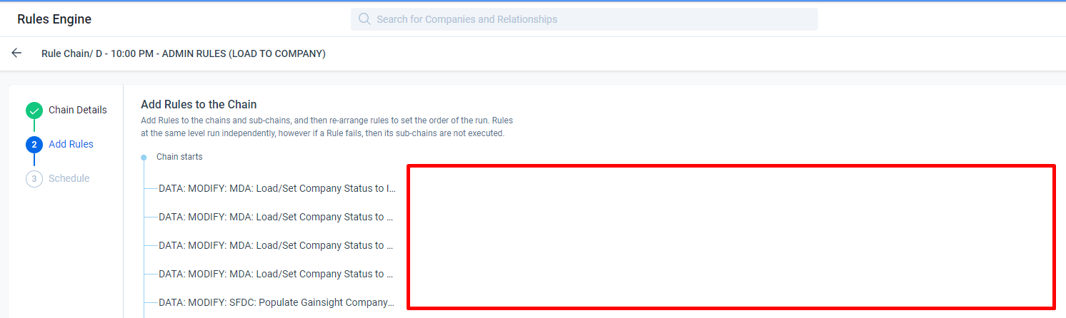
Related products:CS Rules Engine
  • February 9, 2023
  • 35 replies
  • 606 views


I’m not sure if this is a recent change and it seems that it is, but even if not what possible reason is there to clip the rule names and then have all this blank space next to it?


I use a wide monitor, but this is a window taking up only half my screen. It looks the same on my smaller laptop. This is not a screen resolution problem, this is a design problem.

This kind of design does not seem to indicate the users experience is considered at any point, but instead some arbitrary aesthetic.


@ophirsw I know you’ve seen my various posts on whitespace and I’m sure are thrilled to see another :) I don’t search these things out and I’m not particularly jazzed about writing these but it seems that this issue of gratuitous whitespace at the expense of product usability seems to keep happening. 

Is there a better way we can communicate how inconvenient these changes are? Is there some other method we can employ that will have a substantive impact on the way these changes are considered to better take the user into account before implementing? Not trying to be dramatic, but more and more screens we jump to are getting increasingly irritating to use. 

Thanks :)

35 replies

matthew_lind
VIP ⭐️⭐️⭐️⭐️⭐️
February 9, 2023

Yes, yes and yes.

As more Enterprise-caliber companies use Gainsight, the need for naming conventions to remain organized and collaborative because paramount. When names are trimmed or chopped as in @bradley’s screenshot, two things happen:

  • We’re slowed down and we’re less efficient as admins. We can probably make it work, but it sure is harder and more time consuming. 
  • Small doubts surface about why it was designed that way, and was the end user (in this specific example, the customer is the end user) front-of-mind when the UI was changed.


Making people their best....currently disguised as a CS Ops Architect. How can I contribute to your success?
alizee
VIP ⭐️⭐️⭐️⭐️⭐️
February 10, 2023

Good shout @bradley! 

Related: filters in DD and reports.

Could the popup please expand as horizontal scrolling to reach the end of the filter string or case statement condition is frustrating and error prone and there is plenty of space for the pop-up to expand into.


The most expensive part of building is the mistakes. That's true in construction. Not so much in CSOps. So ask questions, make mistakes and learn. All views expressed here are my own.
Gainsight Employee ⭐️
February 10, 2023

Thanks for highlighting this usability issue @bradley @matthew_lind  @alizee 
The width of the Rule Name display field (dropdown here) will be made variable (currently it takes a fixed width), so that it utilises the available whitespace on the screen to show the entire rule name without truncating it. 

We have noted your feedback and this enhancement will be added soon. I will keep you all updated on this.

anirbandutta
Expert ⭐️
February 10, 2023
No Status→Under Consideration
It's an opportunity for engagement
bradley
bradleyAuthor
Expert ⭐️
February 10, 2023

Good shout @bradley! 

Related: filters in DD and reports.

Could the popup please expand as horizontal scrolling to reach the end of the filter string or case statement condition is frustrating and error prone and there is plenty of space for the pop-up to expand into.


Yes! Honestly anywhere you have a 3rd pane that takes up 1/5th of your screen, all but blanks out anything behind it and leaves you moussing over/scrolling or just guessing to find out what is in your fields and filters.

jparker
Contributor ⭐️⭐️⭐️⭐️⭐️
February 10, 2023

Shameless plug for this 9-month-old post with 12 votes and no comment or acknowledgement from GS


Looking for my next role: Gainsight Lead / CS Ops Product Council Member. Let's connect: https://www.linkedin.com/in/jon-parker/
bradley
bradleyAuthor
Expert ⭐️
February 14, 2023

Thanks for highlighting this usability issue @bradley @matthew_lind  @alizee 
The width of the Rule Name display field (dropdown here) will be made variable (currently it takes a fixed width), so that it utilises the available whitespace on the screen to show the entire rule name without truncating it. 

We have noted your feedback and this enhancement will be added soon. I will keep you all updated on this.

Would love to know how that type of user-friendly design can be the default to start with rather than an enhancement :)

darkknight
Expert ⭐️
February 15, 2023

Would love to know how that type of user-friendly design can be the default to start with rather than an enhancement :)

THIS.

Why can’t Gainsight UX Design/Engineering/QA look at this and see that it’s just not user friendly before it makes it to GA?


Jeff Kirkpatrick
anirbandutta
Expert ⭐️
September 11, 2023
The following idea has been merged into this idea:

All the votes have been transferred into this idea.
It's an opportunity for engagement
dayn.johnson
VIP ⭐️⭐️⭐️⭐️⭐️
April 24, 2024

Any update on this? The whitespace in dynamic JO is painful. 👀

Staff CS Content & Comms Manager, 2x Gainsight CS Ops Product Council Member