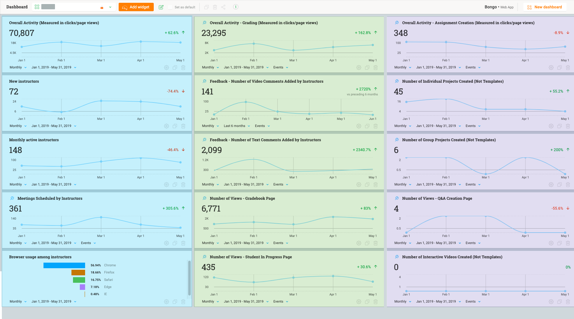
This morning, I conducted a training with one of our Account Managers to create snapshots of usage and activity per account.
The final product was this custom dashboard:
Overall Settings
Every widget is set using the same filters:- Monthly / Jan 1, 2019 - May 31, 2019 / Measured by Events (where applicable)
- Account Name = ______ (account we were measuring)
Big Picture Metrics: Left Column (Blue)
We started by making the column on the left (highlighted in blue) to show some big picture metrics with the following Widgets:- Overall Activity (Measured in clicks/page views) = Events Widget
- New instructors (users)
- Monthly active instructors (users) [list]
- Question: What does this measure exactly? Our view shows 148 active instructors, but that's not the total for the period of time, nor is it the average over the 5 months measured.
[/list]Next, we made two columns for 2 of the main areas of our product that indicate adoption.
Feature Metrics: Middle/Right Column (Green/Purple)
In our product, Assignment Creation indicates the beginning of the usage cycle; Grading represents the completion of the usage cycle that would hopefully lead the user to create more content. Thus, they are high value areas for us to measure. We used the following widgets for the middle and left columns:- Rather than showing events for a specific feature at the top of the middle/right columns, I instead showed the overall level of activity within the Modules that capture Grading and Assignment Creation. [list]
- Overall Activity - Grading (Measured in clicks/page views) = Events Widget filtered down to the Grading Module
- Overall Activity - Assignment Creation (Measured in clicks/page views) = Events Widget filtered down to the Assignment Creation Module
[/list]
Conclusion
- Overall, I was able to demonstrate that while the number of new users and even monthly users has decreased for this account, the level of activity has increased in one of the highest value parts of our usage cycle. The Account Manager is going to take this data to facilitate discussions with stakeholders at this account and increase adoption in other areas of their organization.
Ideas
During our training/working session, a few ideas came up to make this even more powerful:- The ability to apply a filter to the entire dashboard, both for the time parameters and other filters like Account/User/etc. The snapshot is easy to understand once it's all set up, but if I wanted to see a weekly view for all this information, that would be pretty tedious to change all the time parameters (same for other filters).
- The ability to group widgets with different sections and even give each section a title. What I find myself doing when I train others is explaining what each column or row is grouped by. Without me explaining, it's a lot for someone to take in!
- Last but not least, which I was SO EXCITED about: [list]
- I told the Account Manager that he could Clone this dashboard and customize it for other high-touch accounts; he was thrilled! This will save him a lot of time and help him be proactive.


