Hey all!
Note: I honestly thought this was going to be a short post before I started writing... whoops 
I was working with one of our Strategic Partnership Managers yesterday to customize a dashboard for her. We were able to create a great dashboard featuring widgets like New Accounts, New users, Weekly active users, and Feature performance filtered down to her relevant subsets and features/modules.
The main problem she was trying to solve was: "How can I proactively know which accounts are at risk?"
She had 2 main requests/pieces of feedback:
1: She wished she could directly access the specific users/accounts/etc from the widgets. Right now, she would have to review the dashboard, then access Accounts Explorer, Audience Explorer, or Analytics>Features>Adoption to find the specific accounts and users. It's great for her to have a snapshot of her accounts, but it's only actionable for her when she can dig into the specifics. I think making it easier to access these specifics would reduce the learning curve for non-Admin PX users who may be less comfortable with data tools in general.
2: Overall, she noticed that the metrics tend to show the "good numbers". She is also looking for ways to proactively see indicators of account dropoff, or to answer the question, "Which accounts are demonstrating poor health/low usage?" There are some ways to go looking for this information, but what we found is that we needed to know which accounts to look at in the first place. Here were some of my ideas:
A way to surface which accounts have had:
-
fewer than ____ number of users in the last ____ days/weeks/months
-
an average session length less than ____ time (for us, users might stumble across our product but not actually do anything)
-
fewer than ____ number of "significant activities" in the last ____ days/weeks/months (i.e., did they just visit pages or did they actually complete a workflow?)
-
fewer than ____ number of "significant activities" per user in the last ____ days/weeks/months (sometimes we have accounts where there is a handful on power users, but the account itself may still be at risk since we don't have usage saturation.)
-
it would also be ideal to send automatic email reports of the above indicators on a weekly/monthly basis to the Partner Manager
In reference to #3 (did users just visit pages or did they actually complete a workflow?), I found a way to surface this information:
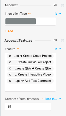
Accounts Explorer
- Filters:
- Account
- Integration Type is _______ (custom attribute, may not be necessary for others)
- Account Features, set to OR
- Feature in ____, _____, _____, ______ (our "milestone" features that indicate the user has completed something)
- Number of total times used Less than ____ (whichever threshold makes sense, I had to experiment with this one)
- Account
Those filters surfaced which accounts have used the selected features fewer than 15 times total.
Analytics > Features > Adoption
I also wanted to see this filter applied to recent activity, not just all-time. I applied the same filters as above to the Adoption view in the Analytics tab.
-
same filters as above, except I added Feature Used between ___ and ___ to match the date parameter at the top of the report
-
Measured by Events / Grouped by Accounts to visually show which accounts hadn't been engaging heavily in those activities recently
- Note: You do have to click into each item in the list of the filtered features below the graph. I believe the "events" measured in the screenshot above refer to the number of times someone in the filtered set clicked "Create Individual Project". If I wanted to see the same measurement for "Create Group Project" for example, I would need to click into the line item below.
- To see which accounts had the lowest usage, you would still need to click into the linked number under Accounts in the above screenshot.
- I saved this report and shared with the Partner Manager, so I'll be curious what she thinks.
Overall, I think these requests demonstrate what Account/Partner Manager roles are looking for in data compared to Product Managers.
Any other ideas on how to create indicators of low or dropping usage for accounts?
Thanks all!


