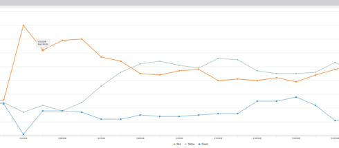
We've raised this issue to Support directly and was told it was a bug; however it's been 3 (3+ ?) releases since it was reported and it's still lingering, so I'm hoping posting here gets some traction :)
We load our scorecard data to the Usage Data object so that we can report on it over time. A few months ago, the colors for Red, Yellow, Green switched to using the Color Palette. We've tried assigning custom colors and adjusting the colors in the Usage Configuration, but can't see to figure out why it changed. We would like for it to be Red, Yellow, Green- it drives our users (especially management) nuts that they cant get a quick RYG view of the report without deciphering the color pallette.
Thank you!
Sign up
If you ever had a profile with us, there's no need to create another one.
Don't worry if your email address has since changed, or you can't remember your login, just let us know at community@gainsight.com and we'll help you get started from where you left.
Else, please continue with the registration below.
Welcome to the Gainsight Community
Enter your E-mail address. We'll send you an e-mail with instructions to reset your password.


