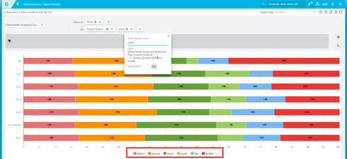
I am looking to make a report of overall customer health, across all customers, as a stacked bar graph. I also want it to use our defined colors for the different ranges. The desired outcome would be a single horizontal/vertical bar that shows me the customer health distribution.
I could have sworn I met someone at Pulse that had this on the per CSM level (which is my next goal after this report anyway). Hopefully someone out there can help!
Thanks!
Question
Can you make a report of overall customer health by color as a stacked bar chart?


Sign up
If you ever had a profile with us, there's no need to create another one.
Don't worry if your email address has since changed, or you can't remember your login, just let us know at community@gainsight.com and we'll help you get started from where you left.
Else, please continue with the registration below.
Welcome to the Gainsight Community
Enter your E-mail address. We'll send you an e-mail with instructions to reset your password.