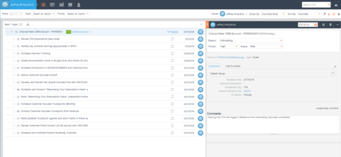
When I view CTA or Task details from cockpit, it shifts to the left and cuts off customer name and the task names. It looks like there is plenty of space, so why do they get cut off?
Page 1 / 1
Hi Jeff,
We have received this feedback multiple time along with other good suggestion for Cockpit. We are in planning to make design changed to incorporate all the great feedback we received. The customer and task name truncation issue you have highlighted here will be addressed as part of the design change.
Thanks,
Sidhu
Reply
Sign up
If you ever had a profile with us, there's no need to create another one.
Don't worry if your email address has since changed, or you can't remember your login, just let us know at community@gainsight.com and we'll help you get started from where you left.
Else, please continue with the registration below.
Welcome to the Gainsight Community
Enter your E-mail address. We'll send you an e-mail with instructions to reset your password.