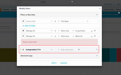
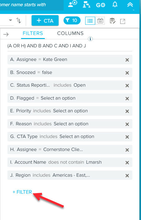
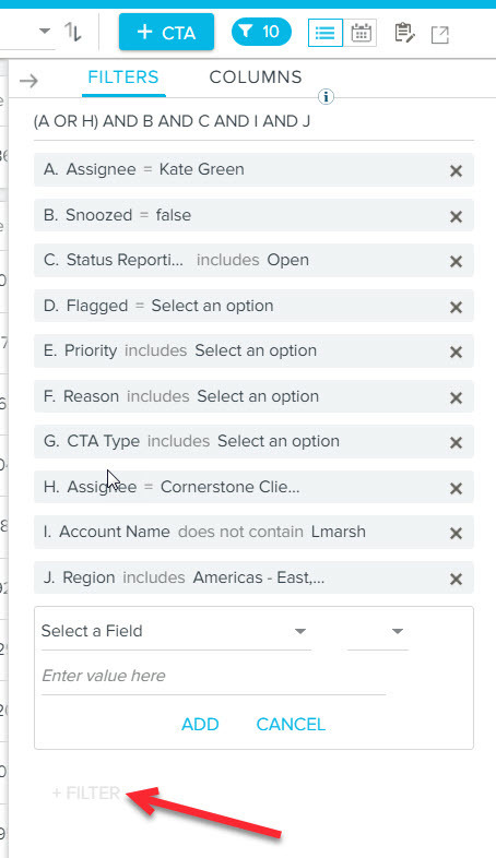
I noticed that if you try to add more than one filter field without filling in the first filter value, you receive an error message, but the UI looks all funky and it's hard for some users to determine what to do next:
It looks like the filter field sits on top of the next section, causing confusion.
Sign up
If you ever had a profile with us, there's no need to create another one.
Don't worry if your email address has since changed, or you can't remember your login, just let us know at community@gainsight.com and we'll help you get started from where you left.
Else, please continue with the registration below.
Welcome to the Gainsight Community
Enter your E-mail address. We'll send you an e-mail with instructions to reset your password.


