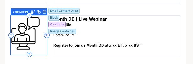
I am struggling with creating a customer email template design.

The ask is simple, have an icon that has the same height as a couple lines of text. The icon is left of the text. I cannot get the spacing between the icon and text to adjust to be appealing.

Here is an example. I want to move the text left. I’ve tried making the “image block” smaller yet it decreases the size of the icon. I want the icon to be the same size as the height of the text so that this template is visually appealing. For what seems like it would take a few minutes, a few hours later, I give up and seek help from this community.

How can I accomplish this? Please note that I am not a coder.

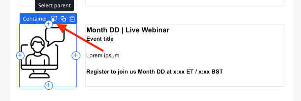
@Stacie, this part of the new email template builder definitely took me some time to get a feel for.

Best advice? Keep an eye on which container you’ve selected. When you add images, each of those containers has different padding and dimensions. Clicking the “Select Parent icon (left-most icon) shows you which container you’re working with.

So this’ll let you adjust the icon padding, where it sits in that left-side column, and then where the text sits in the right-side container. You’ll have to tweak the different elements to get everything to go where you want it.

In this example (final screenshot), I’ve got the blocks set at a 20 pixel indent spacing, which is not ideal (there’s a LOT of white space above and below), but this template is up for a redesign soon.

I’m also not a coder… I do everything in the WYSIWYG drag-and-drop editor.

Hope this helps!


@Stacie, this part of the new email template builder definitely took me some time to get a feel for.

Best advice? Keep an eye on which container you’ve selected. When you add images, each of those containers has different padding and dimensions. Clicking the “Select Parent icon (left-most icon) shows you which container you’re working with.


I’m just getting my feet wet with the new template builder and this tip is golden, I struggled for 10’ trying to align a logo and came here looking for suggestions. Thanks ​@dayn.johnson for sharing your wisdom!


Trial and error, ​@romihache🤣

So many trials… and so many errors.

Almost feels like there’s a need to whiteboard our template designs so we can plan the containers, otherwise can quickly become a container within a container within a container...


Reply