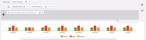
I'm trying to create a report that displays the historical data for a group score in a scorecard 2.0. The scorecard is numerical, but I really only care about it's red,green,yellow data in this report. However, in the Account Scorecard History MDA table, it seems to only show me the number, and any label or colour field I can find only references the overall score, not the group score I'm looking for.
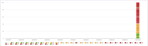
I've ended up with a graph that is divided into many, many sections. Is there any way for me to group these back together into their proper colours? Or does anyone have another idea how to accomplish this?
I've attached an example of the graph I've created here. You can see how it's divided. It causes confusion because it doesn't actually order the numbers in numerical order... I just want all the reds, greens and yellows grouped together.