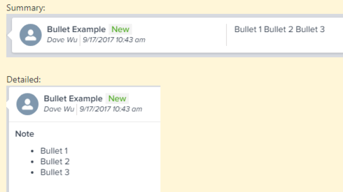
Summary bullet points are shown in a single line while the detailed view is separated. A bit deceiving for the end user when in the Summary view. Can this be enhanced to show the bullets? Screenshot below...
Page 1 / 1
Hi Dave,
We take this approach to show maximum content upfront. If we honor the rich text formatting than only "Bullet1" might be visible in summary view. We will check the possibilities of improving it.
Thanks,
Nitisha
We take this approach to show maximum content upfront. If we honor the rich text formatting than only "Bullet1" might be visible in summary view. We will check the possibilities of improving it.
Thanks,
Nitisha
Nitisha, is it possible to change the title of "Note" to "Notes"? I think this is more grammatically accurate when capturing notes from an interaction.
That makes good sense, Nitisha, though maybe the bullets themselves could still render without the line break, or line breaks could render as a " ⏎ " character?
Hi Dan, Good catch,we are changing to "Notes".
Reply
Sign up
If you ever had a profile with us, there's no need to create another one.
Don't worry if your email address has since changed, or you can't remember your login, just let us know at community@gainsight.com and we'll help you get started from where you left.
Else, please continue with the registration below.
Welcome to the Gainsight Community
Enter your E-mail address. We'll send you an e-mail with instructions to reset your password.