We have a column-line chart where all of the data points of the line are 100%. However, the line appears alongside the bottom (x-axis) of the chart, which visually looks like all data points are 0%:
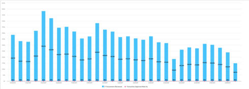
Expanding the date range exposes non-100% values and the line adjusts, such that data points of 100% are above the columns and others dip lower. Intuitively, if all of the line data points are 100%, the line should still appear above the columns.
Interested to hear others' thoughts.
Sign up
If you ever had a profile with us, there's no need to create another one.
Don't worry if your email address has since changed, or you can't remember your login, just let us know at community@gainsight.com and we'll help you get started from where you left.
Else, please continue with the registration below.
Welcome to the Gainsight Community
Enter your E-mail address. We'll send you an e-mail with instructions to reset your password.

