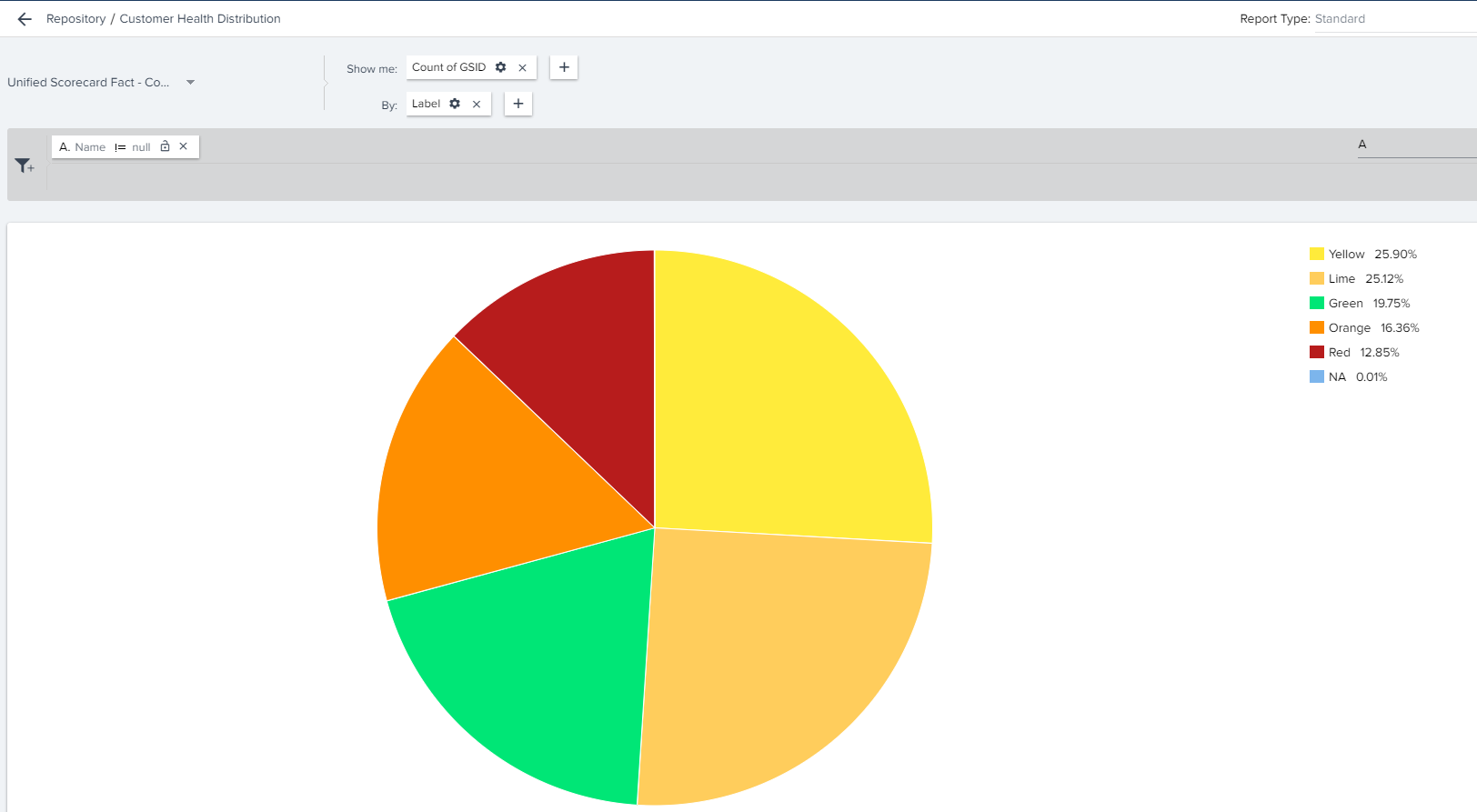
I am trying to create a report fo the CSM dashboard that shows their account’s healthscores in a pie chart format and if they click on the pie chart, they see the underlying accounts.  I want the chart to be color coded and I would like a 4th color for accounts that do not have a health score.


@Dkirkpatrick my first remark is that custom color-coding in Gainsight is a rabbit hole… so be prepared to spend a little time getting the “4th color” aligned!  There is definitely a way to allocate Color by data value, but it would have to be within the object, which you can specify. from the mysterious “three dots” from the report builder UI in top right


Your first place to start from report-builder is:

Object: Unified Scorecard Fact - Company

Report Type: Standard

Show me: Count of GSID

By: Label

Set to “Pie Chart” and you should see your distribution. Now you can muck around with custom colors for that specific object.


Also… @dan_ahrens , since when does Lime look like Peach?  ;) 


Hi @keith_mattes - you need to set the custom colors to match what you’ve named your labels. See this article for more info on setting custom colors: https://support.gainsight.com/SFDC_Edition/Reports_and_Dashboards/Admin_Guides/Color_Settings_in_Reports_How_it_Works


Ok fine, I will go update the colors on that object, was under the impression this was a default setting perhaps :)  Thanks!


Reply