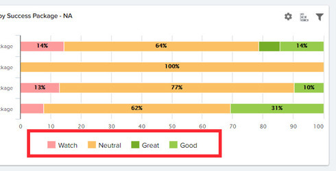
I have created some charts showing the breakdown of health scores by Success Package type and yet the scores are not displayed in order. How can I get them to go in the correct order, as configured in the Scorecard administration page.
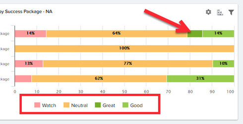
Additionally, the labels in the key for my scorecard bar chart shown below are out of order. Does anyone know of a work around (besides naming them "1-Watch", "2-Neutral", "3-Good", "4-Great")
Thanks!
Page 1 / 1
Hi Kate, as you noted, the order is based on alphabetical sorting. Prefixing with a number is a valid solution. Another solution that's specific to your data would be to change "Great" to "Awesome" (or really anything that is better than Good and would come before Good alphabetically). 🙂
Thanks yea that's what I figured. Would changing the names of the labels change the order of the colors in the bar charts too?
Seems like this could be an enhancement for Scorecard because people aren't going to always want to change their Health labels to suit alphabetical order. Since it's configured elsewhere (in Scorecard 2.0) in a specific order, maybe that could translate into reporting better.
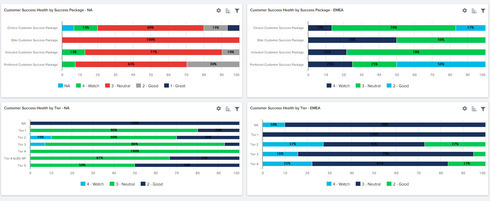
I attempted to change the names of the labels and what has happened is the color scheme changed too. Now, as you can see from the below dashboard, the colors aren't even consistent throughout the reports (note Neutral is red in one report and green in other and blue in yet another). Why did the color convention switch to my default pallet when I changed the names of my labels to include a 1, 2, 3, 4, and 5?
Hi Kate,
Yes, changing the labels will change the order of the stacking in the stacked bar chart to match your sequence.
When you changed your labels did you also go into your Custom Color configuration and ensure that you had the custom colors defined for the new labels that you created?
If specific matches do not exist for your new label types, the default palette will be assigned to those labels.
Ok, so you're saying that if we use anything other than the system default Label names (Great, Good, Neutral, Watch, and At Risk), then we need to define at the Report Builder level a custom color palette for the following:
Object: [Name of Scorecard] Scorecard Fact
Field: Current Score ID > Label
Correct?
Object: [Name of Scorecard] Scorecard Fact
Field: Current Score ID > Label
Correct?
Reply
Sign up
If you ever had a profile with us, there's no need to create another one.
Don't worry if your email address has since changed, or you can't remember your login, just let us know at community@gainsight.com and we'll help you get started from where you left.
Else, please continue with the registration below.
Welcome to the Gainsight Community
Enter your E-mail address. We'll send you an e-mail with instructions to reset your password.