We're really excited to announce that the WYSIWYG editor is now available on Branded Templates.


Please see the previous announcement topic for more information about the specifics of what's included in this update. We're sorry for the delay to the launch, but we made some good steps and are now much more confident in the quality of the editor.


Upcoming priorities to deliver for the WYSIWYG editor


  • Available in the Control environment (including @mentions!)

  • Attach images in private messages


Spotted a bug?


  • The new editor makes it much easier to create complex formatting on posts.

  • We've tried to cover the most common cases in order to make using the editor as satisfying as possible, but the amount of combinations that can be created...well it's a big number.

  • As a result, we expect that there'll be some corner-case bugs we've not spotted.

  • We'll focus on fixing any issues discovered that occur often or have a high impact.


Got feedback on the design / UX of the new editor?


  • We'd love to get your feedback on the new editor (and also feedback from your end users)! Please post your feedback in this topic so we can discuss it 🙂

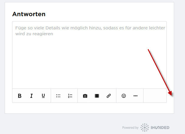
One of our German super users reported a missing reply button in Firefox. I couldn't reproduce it - for me the button is simply there in Firefox.


Thanks for letting us know @JΓΌrgen J. We'll add that to the backlog to investigate - my guess is that due to the length of the word 'Antworten' the button isn't showing up at every single screen width.
@daniel.boon It's on the English as well - once your screen is smaller you can't reply.


It works fine on here but not on ours 😒
It's so much easier now to type lists. πŸ™‚
@Lorna


We've looked into the issue and managed to reproduce it on TomTom EN and here on inSpired - there are 3 pixels (screen width: from 461px to 463px inclusive) where the reply button is not visible. W/ the German translation, there is a larger range of screen widths where the reply button is not visible.


once your screen is smaller you can't reply.


Could you perhaps provide some more details? About the size of the screen, and the browser/device? The way you've phrased it makes it sound like it might be a bigger issue than 3 pixels πŸ˜•.
For a post it does appear to only be a few pixels.


When you edit a post you see the same issue but a larger screen as it pushes the side grey space back like this:


That seems to be around 1014 to 1057 px... around where you have a breakpoint. You switch from full width on the post window to show the right column and this issue covers that. As soon as you get the right column you lose the space for the Save button... until you get wide enough for it again. Presumably this also gets worse in German 😁
Could you perhaps provide some more details? About the size of the screen, and the browser/device? The way you've phrased it makes it sound like it might be a bigger issue than 3 pixels πŸ˜•.


I'm checking with the super user on the German forum.

Reply