

Horizon Rules UI - Fix the need for a scrollbar upon adding filter criteria
Hi Folks,
I couldn’t find an idea/enhancement request listed already for this - apologies in advance if there is one and I’ve missed it!
Across features in Gainsight where horizon queries can be built (Rules/DD/New JO Queries), depending on the criteria selected (name of the field, field datatype, and operator) this can cause a horizontal scrollbar to appear in the filter modal.
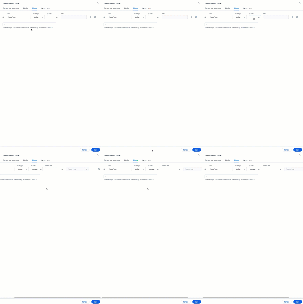
Once the operator is selected, the end user has to scroll to the right of the modal to be able to add a new filter field, or delete a particular filter.
This may seem trivial, but when you have mulitple filters per dataset/node and you’re working within HRE pretty much every day, it becomes extremely tiresome - especially since there is so much whitespace on the page when the filter modal is open.
The ask would be for the stakeholders responsible for Horizon UI to review this specific area of the UI for improvement; can the modal be made bigger, are there changes in responsiveness that would remove the need for a scrollbar, or should buttons in the UI be rearranged so they’re not at the end of the page?
This is a small change, but would be a huge quality of life improvement for admins using the Horizon engine on a daily basis.
Other admins, what have I missed?
Thanks,
Stuart