Hi there,
New to Gainsight, and first time posting. Scrambling a bit to try to get my first in-app campaign pulled together.
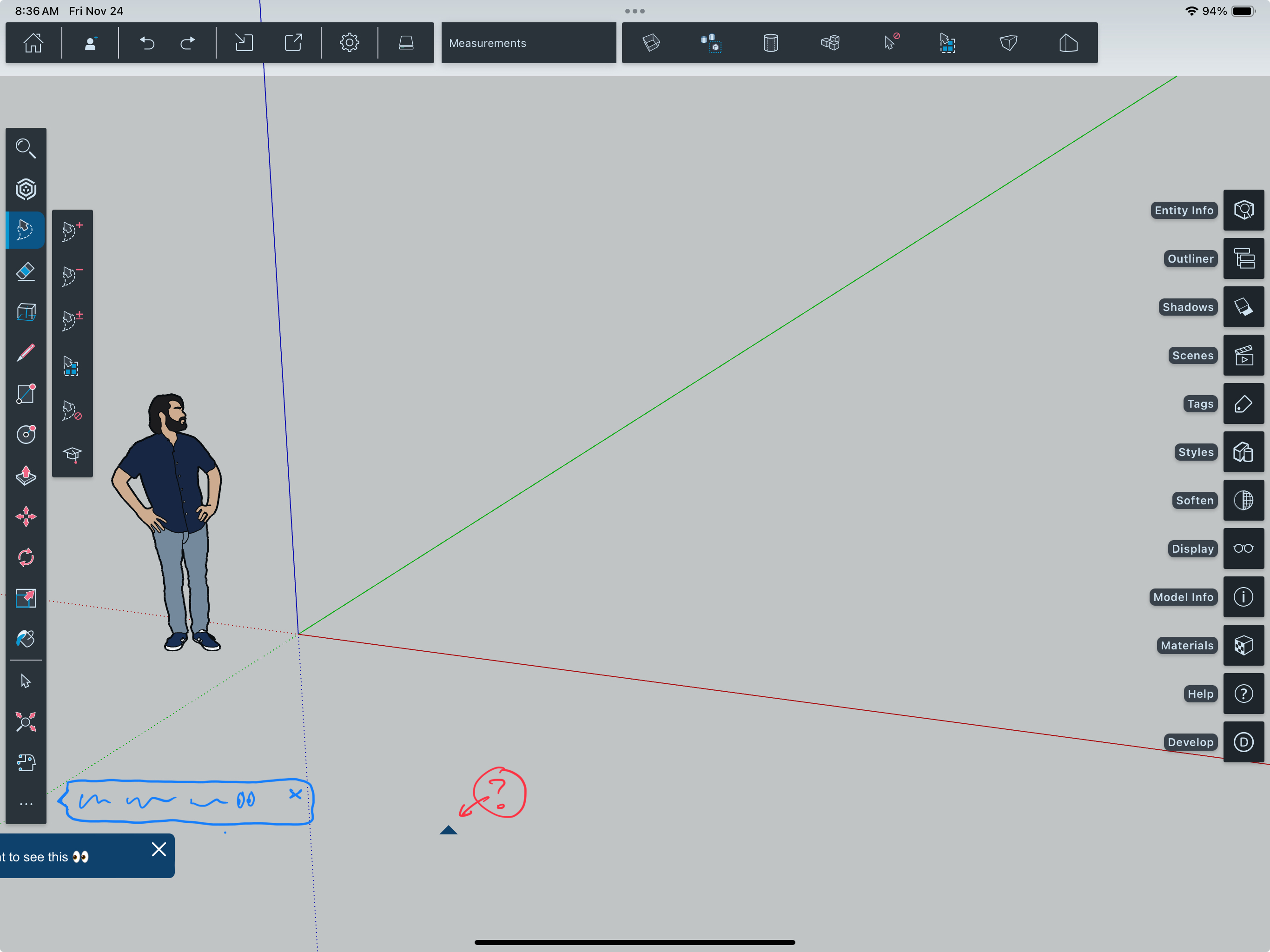
I’ve made some progress, and I’m at a point where I’ve created a tooltip, and am able to preview it in-app.
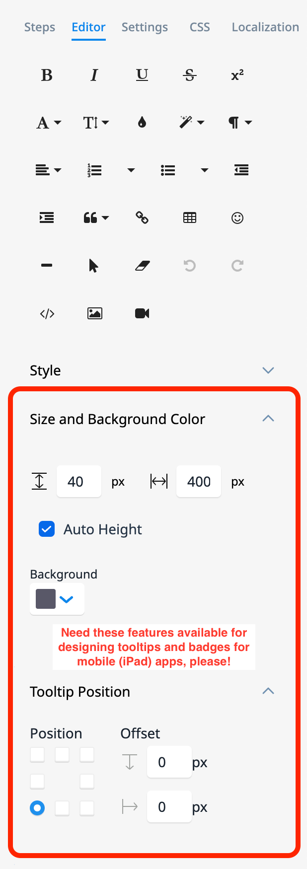
The challenge I’m facing at the moment is that the location of the tooltip is a bit whack (centered below the ellipses button, bleeding off the screen, and detached from its little arrow) and I’m not sure how best to reconfigure it. The template editor seems to lack any features that would allow me to position the tip in a logical position (to the right of the button, with the arrow pointing left, to the button). I get the sense that maybe this is possible with CSS, but my CSS skills are non existent.
Looking for suggestions for documentation, other threads, or any other places where I might be able to find some code snippets that I could tinker with?
Thanks in advance for any assistance!


