Contributor ⭐️⭐️⭐️⭐️
January 18, 2020
Solved

C360 Usage Section - DAU, Total Users, Unique Features Segment

  • January 18, 2020
  • 3 replies
  • 188 views

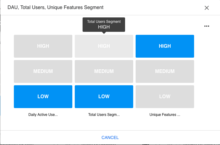
We’re pulling usage data from PX and have the widget below in our “Usage” section in C360. Can someone explain to me the differences between High, Medium and Low? What are the criteria for each category?


    Best answer by link_black

    @jriva 


    This heat map view is created using Data Science algorithms against ALL of your customer PX usage data with the powerful Customer Success Adoption Explorer feature.  You can read more about this CS feature in that link to our online documentation and your Gainsight Customer Success Administrator can even change these settings and many more within your Customer Success application.


    In this case, three distinct data Segments or groupings are automatically identified (high, medium, low) using Data Sciences against ALL of your customers PX usage data.  Then, this Adoption Explorer data visualization displays where this particular customer fits for each of the selected fields compared to all your other customers.


    So, I would interpret this heat map above to mean that this customer’s usage of your product as tracked by Gainsight PX is…

    • in the lowest 1/3 segment for DAU’s … as compared to ALL your other customers’ DAU’s
    • in the lowest 1/3 segment for Total Users … as compared to ALL your other customers’ Total Users
    • in the top 1/3 segment for Unique Features used … as compared to ALL your other customers’ Unique Features used

    In short, they have less daily active users and unique users than most of your other customers.  But, their users tend to access more of your different features than most of your other customers.


    I hope this helps, but definitely have your Gainsight Administrator spend more time learning about our Adoption Explorer feature in Customer Success and how to configure/modify any of these layouts and data visualizations.

     

    3 replies

    jrivaAuthor
    Contributor ⭐️⭐️⭐️⭐️
    January 23, 2020

    @link_black any idea?

    link_black
    Gainsight Employee ⭐️⭐️
    January 23, 2020

    @jriva 


    This heat map view is created using Data Science algorithms against ALL of your customer PX usage data with the powerful Customer Success Adoption Explorer feature.  You can read more about this CS feature in that link to our online documentation and your Gainsight Customer Success Administrator can even change these settings and many more within your Customer Success application.


    In this case, three distinct data Segments or groupings are automatically identified (high, medium, low) using Data Sciences against ALL of your customers PX usage data.  Then, this Adoption Explorer data visualization displays where this particular customer fits for each of the selected fields compared to all your other customers.


    So, I would interpret this heat map above to mean that this customer’s usage of your product as tracked by Gainsight PX is…

    • in the lowest 1/3 segment for DAU’s … as compared to ALL your other customers’ DAU’s
    • in the lowest 1/3 segment for Total Users … as compared to ALL your other customers’ Total Users
    • in the top 1/3 segment for Unique Features used … as compared to ALL your other customers’ Unique Features used

    In short, they have less daily active users and unique users than most of your other customers.  But, their users tend to access more of your different features than most of your other customers.


    I hope this helps, but definitely have your Gainsight Administrator spend more time learning about our Adoption Explorer feature in Customer Success and how to configure/modify any of these layouts and data visualizations.


    -- Link
    jrivaAuthor
    Contributor ⭐️⭐️⭐️⭐️
    January 24, 2020

    Thank you @link_black - very helpful!