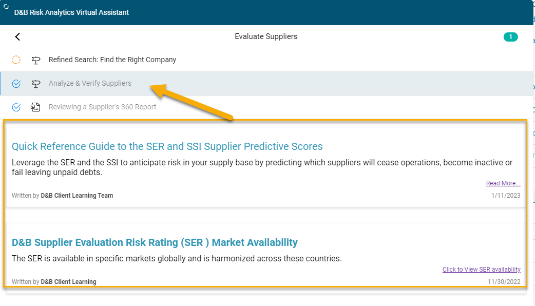
We are seeking to assure our Guide Engagements are the main focus for learning content in our KBOT.
The font on the engagements is much smaller and less noticeable than some of the articles we add. In this screenshot, the top 2 are engagements, the 3rd is an article I built in Gainsight (default view) and the highlighted articles are also in Default view but are articles linking out to content. These appear much larger and there is no difference between default and card view.
Is there a way to standardize the way our content displays?


