Hi all,


In the last iteration of our NPS Survey we moved from a dialog to a banner. Since then we’ve noticed more “0” scores and, upon follow up by CSMs, it seems they’re often “false” scores in that the user isn’t particularly unhappy, they are just trying to dismiss the survey from their screen. Those “0” scores then screw up our metrics.


The dialog has the close (“x”) icon in the top-right, which is where users would expect a dialog close button to be. The banner also has the close icon in the top right, but because the banner occupies the full width of the window, the close icon is a long way from the user’s focus. Could that account for the difference in response patterns? Would a “Dismiss” or “Remind me later” button closer to the center of the page save us from these false scores?


BTW, We moved from dialog to banner because some anecdotal research suggested that users found the dialog obtrusive and somewhat annoying. :-)


Just wondering if anyone else has seen similar differences. We’re probably going to run an A/B test to see if it makes an ongoing measurable difference.

 

Hi Matt,


Thanks for posting to PX Community!


While I am unable to confirm/deny if having the little “x” in the top right corner to close the survey is influencing these false “0” NPS scores … yikes!!! … here are some things you can consider to mitigate this as a potential cause of these...


First, every NPS Survey in PX has at least two screens … the initial one the user selects the NPS score on and then the second one with the “Submit” button.  The third “Thank You” screen is optional and can be turned on/off as required.


So, if some of your users are clicking “0” and then “Submit” on the next page to “get rid of it”, then you could use the configuration setting “Set Comment As Mandatory” to at least force the user to explain their “0” NPS score or even reconsider their “0” score and correct/explain it before successfully submitting.  My tip: I would recommend as a best practice to require NPS comments, since there are fewer things worse in Customer Success than receiving a detractor or passive NPS score without any context or clues to explain why the user felt that way.   But, that is every customers’ decision to make for their users.


However, if these “false” scores are truly due to the user not being able to find the little “x” in the top right corner to close the survey fast enough, you can also consider this...


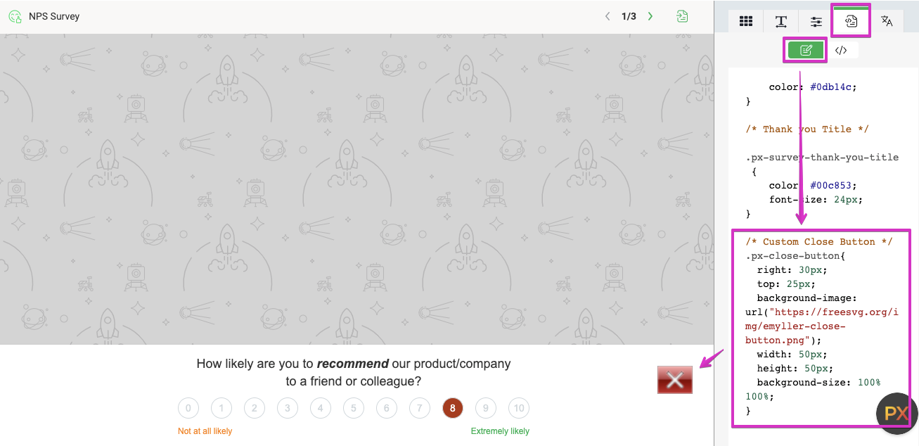
I explained part of this in my previous PX Community post here, but PX allows you to override our default PX Engagement CSS styling as well as to create your very own amazing CSS styles. So, with a little custom CSS code you can change the “x” to a more prominent icon and even change the position to make it more visible.  Here is an example below:


I hope this helps a little!


Matt, these are really great questions. I think some A/B testing could be really helpful here. My sense is the banner is more disruptive than the dialogue engagement type; but if you do use a banner, the exit option should be very clearly presented.


Thanks for the feedback!


Hi @matt 

Closing an NPS via X does not set this NPS as 0.

What I would suggest is:

  • Do not use overlay (it’s a Wysiwyg setting) with your NPS so the user is not blocked
  • Choose the right location, a feature completion page is ideal, users tend to be more balanced if you’re asking for feedback once they have completed a task, for example - trigger the NPS once they have saved a Celigo connector. 
  • User Bar and not dialog option

You can see some of the relevant settings here:

https://community.gainsight.com/px-discussions-22/increasing-mau-through-engagements-37369


Reply