Greetings!


A customer recently posted about improving PX Guide completion rates and I hope that you all have read that excellent post … submit your comments please .. hint, hint, wink, wink, nudge, nudge! ;)


One thing that could possibly help with PX Engagement Completion rates for Sliders and Guides is to prevent the user from clicking the little “X” in the top right corner to close the Step.  It is very possible that we users just instinctively click “close” on popups to get rid of them, since the world could use way less ad popups for sure.  But, your Sliders and Guides are NOT ads and are designed to help users, so why not eliminate that option for them so that they do what they should next?!?!


There is not currently a config option in Engagement to simply turn this “X” close link on/off, but fortunately PX allows you to override our default PX Engagement CSS styling as well as create your very own amazing CSS styles. So, here is how it can be done…


Here is the exact CSS text that you will need to use:

/* Custom Close Button */
.px-close-button{
  display:none;
}


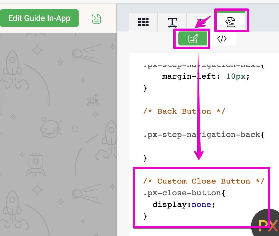
And here is where you put it in our PX Engagement editor:
 

And here is the end user result:


This CSS customization will also work for Dialogs and even Surveys, but be sure to give your users a way out, such as a button or hyperlink.  The worst kind of popup is one that never goes away! ;)


I hope you enjoy and use this suggestion, but interested in your continued feedback for sure.


That's definitely an interesting tip @link_black, but it makes me wonder if we want to force our users to go through the guides. If the targeting is not fine-grained enough, the guide might not actually be useful for them (e.g., they have already used the functionality that is being explained) or they might just not feel like taking a tour ("I just want to get started on my problem").

At the end of your post, you say "be sure to give your users a way out, such as a button or hyperlink". How would  you see that? Isn't that just replacing the little "x" by another button?


Thanks for your comment @Jef Vanlaer ! 


I totally agree with you, so this kind of change needs to be used carefully and with purpose.  We use and recommend our TRUSt framework as a best practice for implementing Engagements, so this worth a review if you have not already.


For Dialogs, I would recommend NOT not using this … but possible.  A “Got It” or “Thank you” button could be added or simple screen refresh should provide an escape route for all Engagements provided that it is not using a paywall Qualification Scope.


For Surveys, I think it does make sense sometimes … not long ones … but short ones like NPS and CES seem like good candidates for this.  Only with user feedback can the users’ experience be improved, so it is a win-win in many cases.


Within Guides, I see some good value with this. Perhaps it is best suited for new user onboarding Guides to ensure they come up to speed quickly, since the new user knows almost nothing and are probably tasked with learning your application first and foremost and not usually trying to do something else immediately.


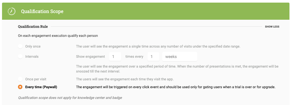
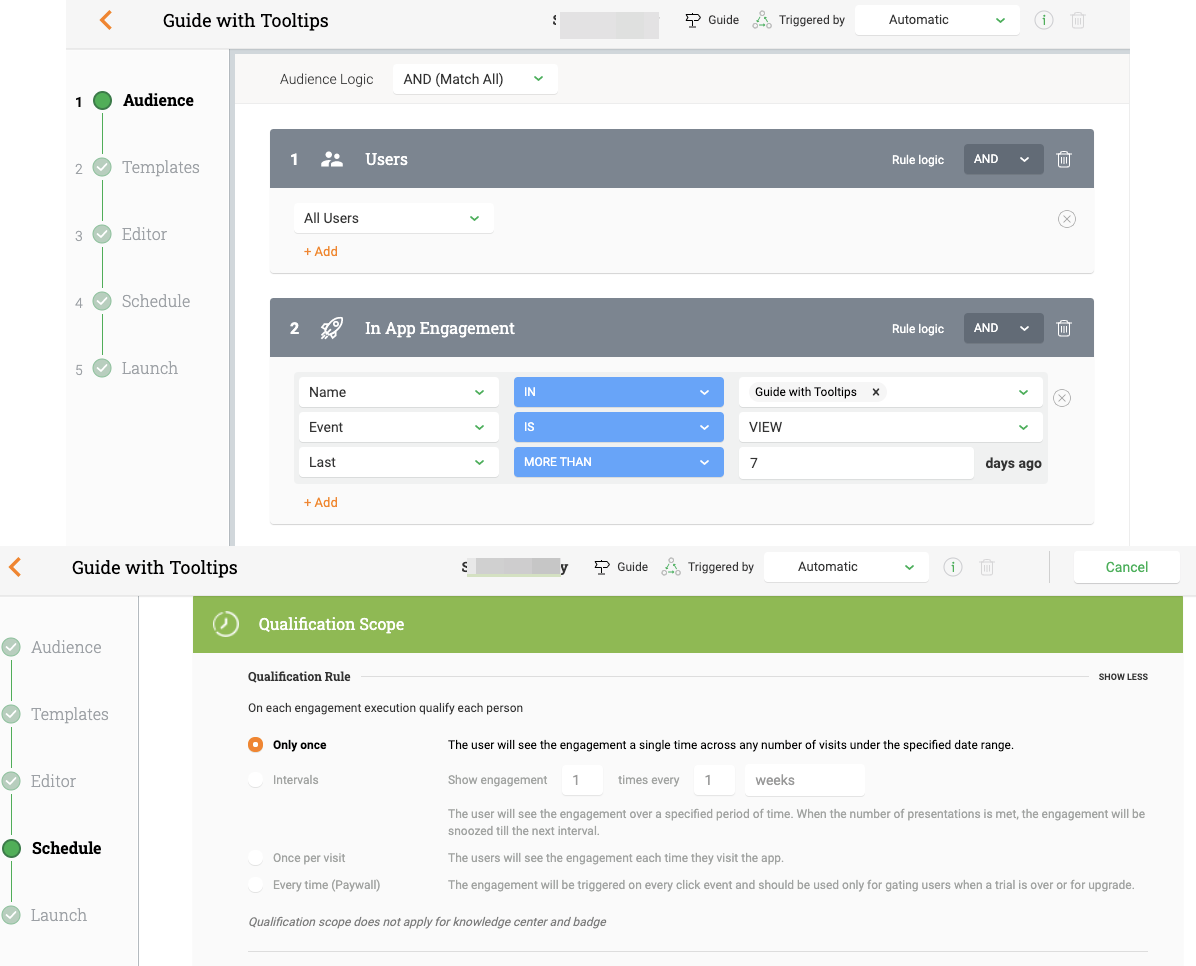
For Sliders and Guides, there is the concept of Viewed vs. Completed by the user.  So, with a combination of Audience Rules and Qualification Scope you can set these Engagements up to replay at regular intervals until the user actually Completes it … on their time … and this type of configuration would be preferred to use for new feature launches and new application updates/releases.

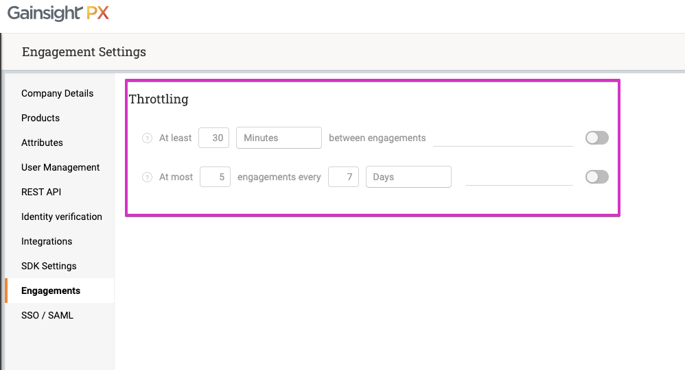
We also introduced a new “Engagement Throttling” option to ensure that users are not overwhelmed with Engagements, so this will also improve the overall user experience.


And Lastly, you can add all of these Engagements to your Knowledge Center Bot (KC Bot) so users can access them at any time or when they HAVE time.  So, that is a great option too!


PX gives you many options to potentially use, but these are your users and YOU own their experience, so choose wisely.


Thank again!


Great suggestion, thank you! Clicking my custom button will reload the full page. It’s a pretty jarring experience. This happens whether I put something like “#” to my button href, or leave it empty.

Is there a straight-forward way to make the custom button simply close the dialog (like the 😵?

Thanks!


@peppe thanks.  Sure, try this in your href in your custom button…


“… onclick=’return false;this.window.close();’ ...”


Works like a charm! Thank you so much!


Reply