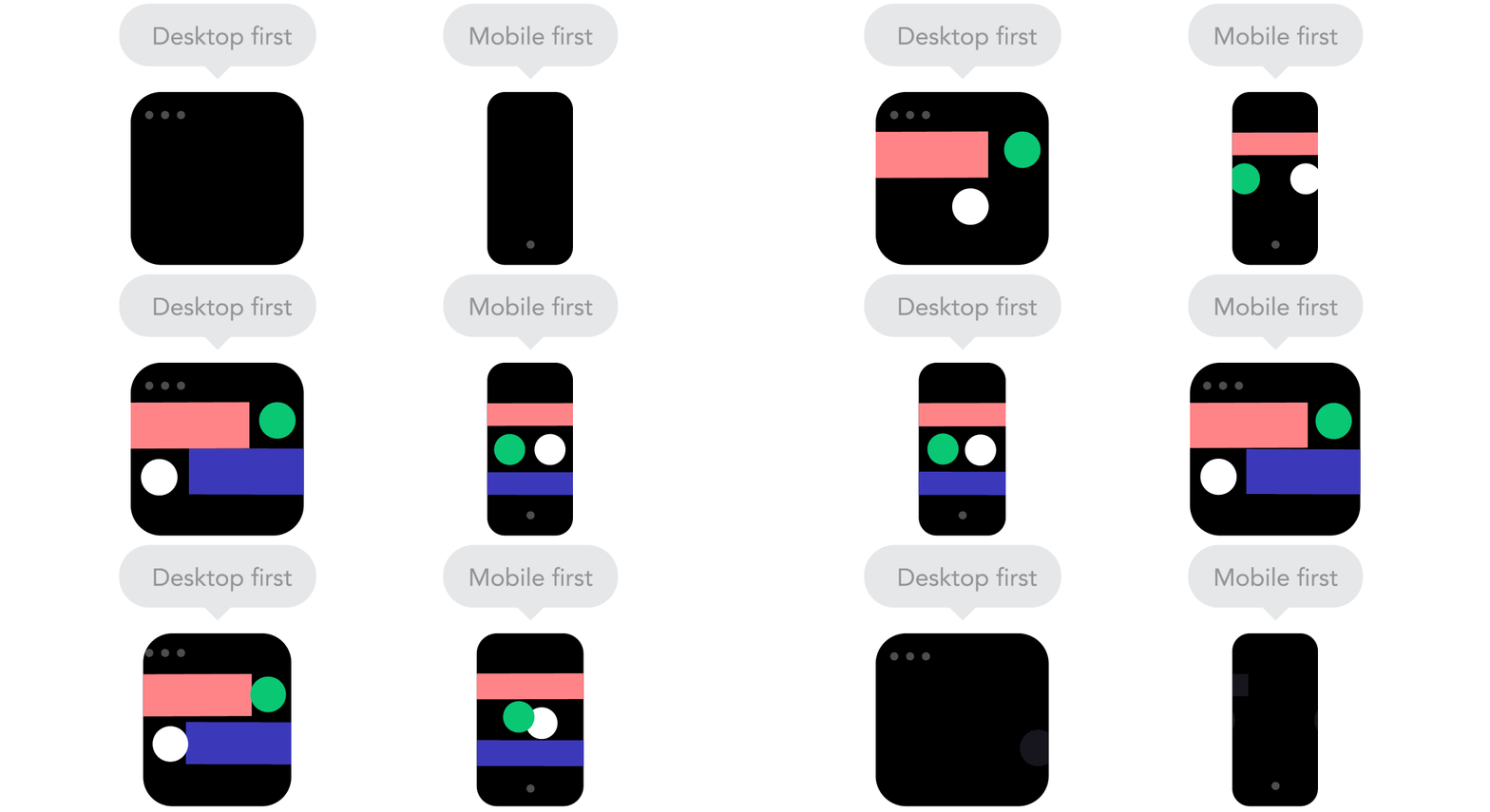
We want to offer a high-quality experience for all visitors, no matter what device they are using. Our fully responsive design is there to ensure that every user can enjoy the community, even on smaller screens.
As we constantly improve the platform we also have to make sure that the experience on smaller screens remains good. This is why our product team organized the "mobile week" @ inSided:
During the mobile week we wanted to access our own (internal) Community as much as possible via mobile, in order to spot those issues which are only visible to people who access via their smartphones. We had two goals:
- To boost the mobile usage during this week from 15% to more than 50%.
- To receive as many reports on bugs / layout issues as possible, so that we can optimize the mobile experience even more.
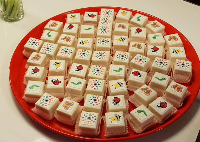
Of course this had to be rewarded with some cake! 🍰
The cake is already gone by now, however we still need to work our way through our list of bugs & improvements. Some things have been picked up already, so expect that the mobile experience will improve over the next weeks and months even more!
Got a mobile bug / issue / limitation which is annoying you or your users? Let us know here, we will check if it's already on our list (and add it, should it not be included)!
Cheers,
Julian


