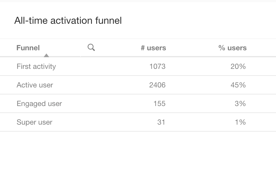
I was looking at the activation funnel - not sure I completely understand what its reporting, and was hoping someone can help. For example active user - does this mean that 45% of my users are active, based on the reporting period? I also switched the reporting period and noticed that the numbers do not change.

Also I have 99K users and I don’t think 2406 is 45% of them.

I am sure I have this all wrong - be great to get an explanation to clear my thinking - Thanks
 

Hey @aluciani,

Unfortunately, it looks like the funnel is not behaving as intended. The % users should be the % of users who have made at least 1 post, but even that does not seem to be calculating correctly.

This widget is actually one of the ones that we don’t currently plan to rebuild in the new success dashboard. We do have the intention to revisit the idea of an activation funnel in the future, although we don’t have any concrete plans yet.


@daniel.boon based on your reply here, am I correct in understanding there’s no way to report on the activation funnel as outlined by inSided within inSided? If we’re using the Salesforce integration, it looks like I should be able to build a custom dashboard in SF to visualize the funnel. Can you confirm? My thought is this:

Create the following reports (all Report type: Contacts with Community Members):

  • Registered Users Report
    • Filter: Total Posts = 0
  • First Activity Report
    • Filter: Total Posts = 1
  • Returning Member Report
    • Filter: Total Posts >5, <25
  • Engaged User Report
    • Filter: Total Posts >25, <100
  • Super User Report
    • Filter: Total Posts > 100

I’d then build a dashboard to visualize these numbers and calculate conversion rates between each to compare to inSided’s benchmarks. Does this seem like the right approach to you? Can you consider a better way to do this?


Lastly, what research was done to obtain inSided’s benchmarks for these conversion rates? They’re incredibly helpful but I’ve gotten questions about where the numbers come from from execs internally and would love to cite a specific study, sample size, etc.


Hey @adam.ballhaussen → that’s correct, we don’t offer an out of the box report for this at the moment. Definitely within Salesforce you have all the data you need to make an advanced report to visualise a funnel like this. I know that some other customers use our CSV exports to accomplish the same goal. For benchmarks I’d have to defer our Customer Success team → perhaps @Julian or @Shane1 would know more.


Thanks for the reply @daniel.boon. I hope to learn more about the benchmarks as well. I brought this

up in a meeting with our CSM yesterday.


Thanks!


I personally do these calculations quite often for meetings with our Community Managers, it is actually quite easy to do via csv export. You simply have to do a user export and then create a pivot table that shows how many users had which level of activity. With this you can then display the conversion of users to the next level in a funnel. Some customers like to also take likes into account, the user export also holds this information.

Let me know if there are more questions around this!


Hey Julian, that’s great to know. Thanks for the added tip. 
 

Could you provide anymore insight on the following request for details on the research used to arrive at the Activation Funnel Benchmarks that inSided uses?


Lastly, what research was done to obtain inSided’s benchmarks for these conversion rates? They’re incredibly helpful but I’ve gotten questions about where the numbers come from from execs internally and would love to cite a specific study, sample size, etc.


Sorry, I also just noticed I missed to respond to this. I am actually in charge of doing these benchmarks, next to other data we are benchmarking amongst our customers.

In your case, I would assume that you are looking at the B2B activation funnel benchmark of mature communities, correct? It usually says that on the top of the slide.

This benchmark includes all 2020 data of all B2B communties which were live for at least one year. If I remember correct we compared 10-15 communities at that time.

We do not have a study or a document which we could share, but I am working on releasing something like this throughout the summer once the new benchmark is there. We basically went through all the communities that we have and create a massive sheet where all this data sits. Then we categorize communities based on:


Vertical

B2B or B2C, but also other general categories which a community might fall in (e.g. Consumer electronics).

Maturity

We manaully defined categories of maturity mostly based on growth/activity, but also on use cases, product adoption and strategic setup e.g. advocacy program.

Age

The total amount of years live (including prior to a migration) gives us another filtering opportunity (e.g. to identify the top starting community in 2020).


This way we can even generate multiple benchmarks that give a better perspective from multiple angles. As mentioned before, I plan to have more information on all of this ready this summer, hopefully you can then get even more benchmarking data to excite your colleagues!


This is absolute gold 🥇


Thank you @Julian! That’s exactly the info I was looking for. I’ll share this with my colleagues and executives. They’ll be happy to hear that we have more benchmark data coming :) 


And indeed, to confirm your question we would be looking at B2B SaaS communities specifically.


I’m hoping that in one year’s time our own community’s data will push those activation benchmarks up even more.


Thank you!


Happy to hear that this helped! :)


Reply