Hello!

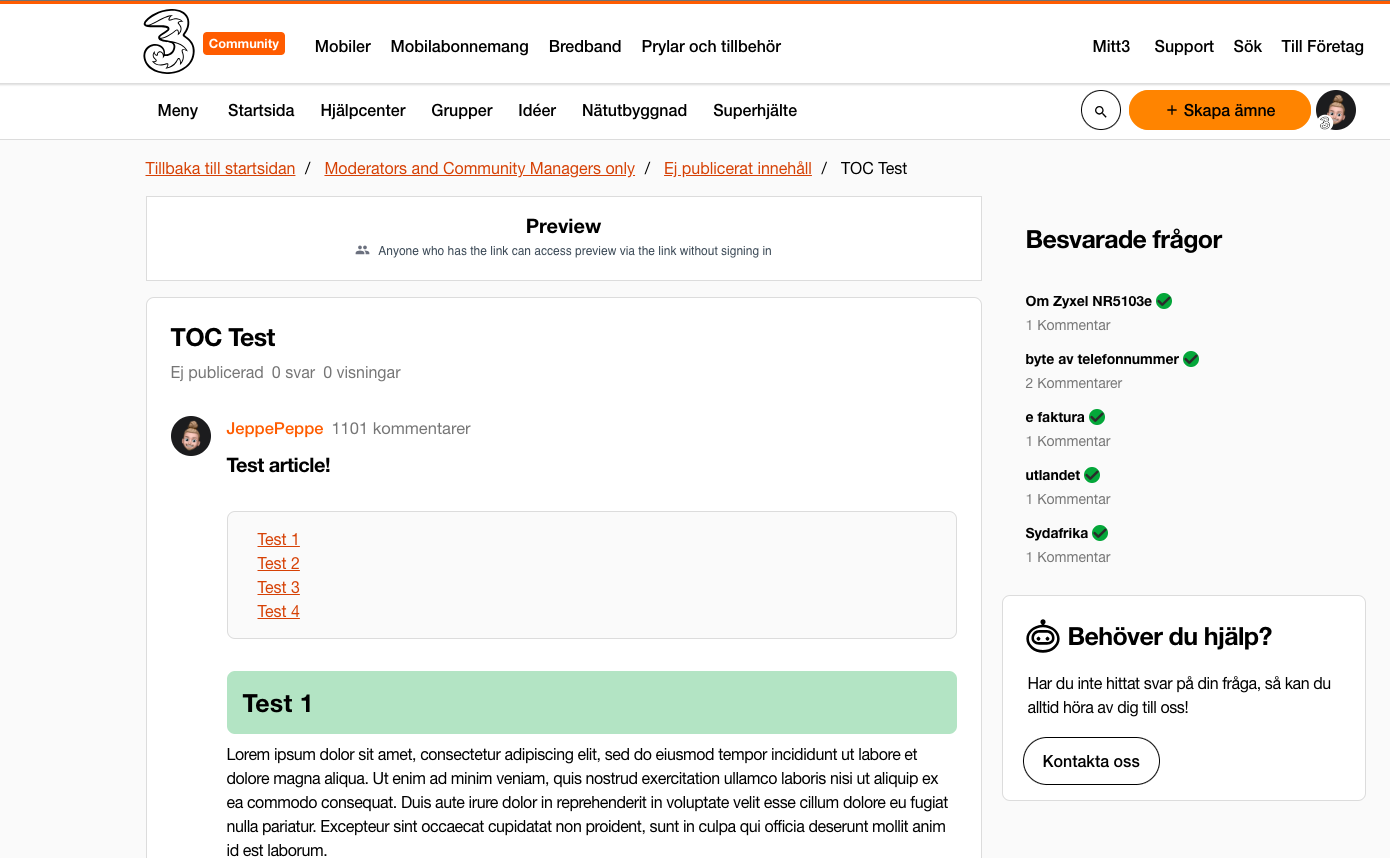
Is there a way to configure the table of contents so that when you click a link(anchor tag), the heading that you’re taken to is shown in the middle of the screen instead of at the top of the screen? Today the information isn’t centered which can be quite misleading when trying to find the correct information.

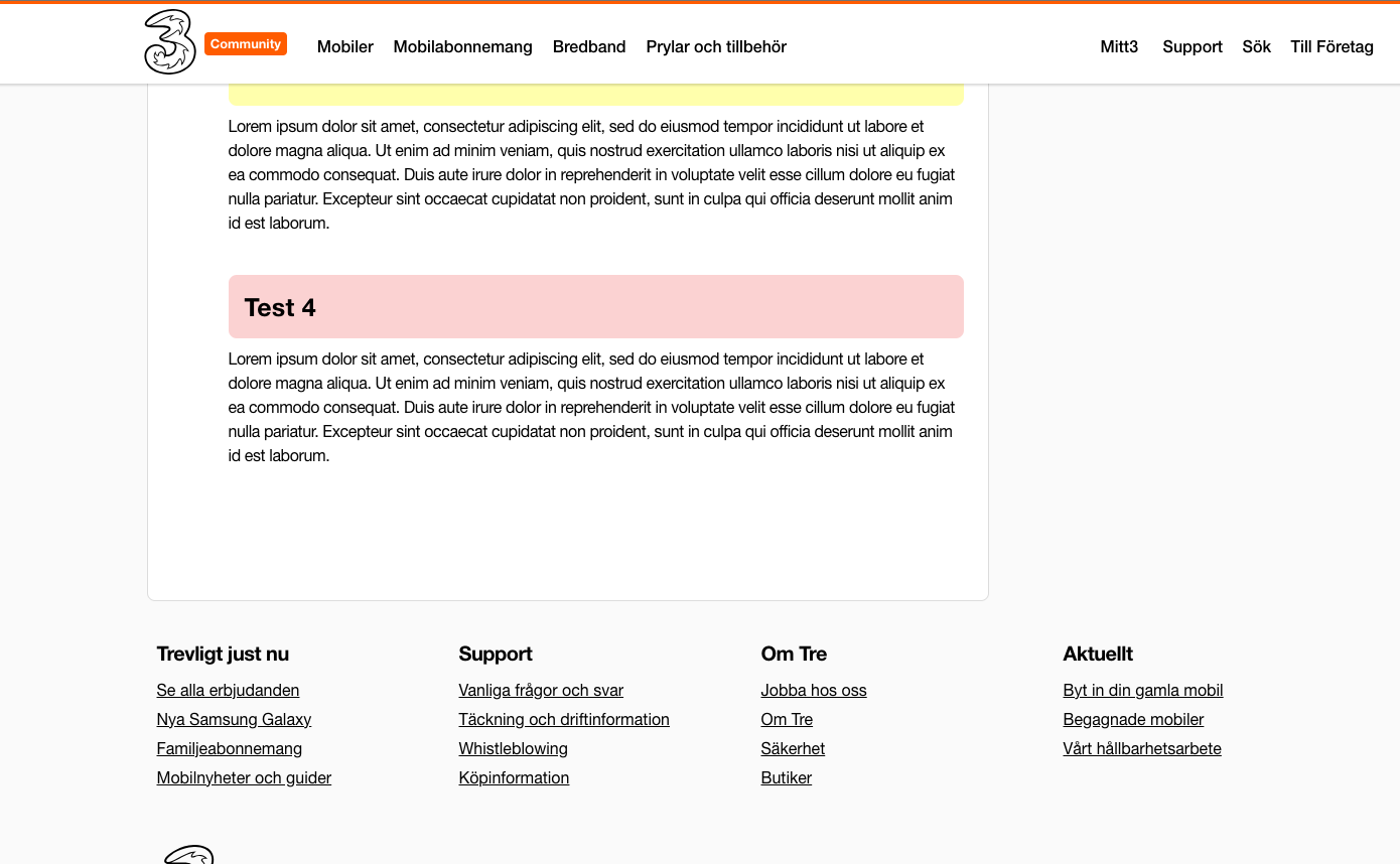
In this example, I click “Test 3” in the TOC - but the heading(Title: Test 3) is hidden under our custom header:

(we have customised various article components, so our TOC and Callout-cards doesn’t look like the standard from gainsight)


  1. Clicking “Test 3”


The more logical presentation is that the content would be shown in the middle or slightly above the middle of the screen. Is there a way to adjust this in custom CSS or TPS?😁


Another addition - Is it possible to add a smooth scroll instead of being teleported to the title? 😅


Hey @JeppePeppe - it’s been a few days and nobody has chimed-in here yet, unfortunately.  I think it’s because what you’re looking for does indeed call for some custom coding that’s beyond the expertise of most folks (including mine!).  🙂 Let me see if I can find something for you, though - will circle back!


Hey @JeppePeppe 👋,

So the issue with the anchor tags taking you to the middle of the respective section is being caused by your custom header so you’d need to work with your web developers so that it lands in the expected place.

For smooth scroll behaviour you could add some CSS such as:

html {
scroll-behavior: smooth;
}


Thanks for chiming-in @olimarrio ! 


Hey @JeppePeppe 👋,

So the issue with the anchor tags taking you to the middle of the respective section is being caused by your custom header so you’d need to work with your web developers so that it lands in the expected place.

For smooth scroll behaviour you could add some CSS such as:

html {
scroll-behavior: smooth;
}


Darn! Thought I could be sneaky with som easy custom code/script. Thank you @olimarrio, will look into this! 😁


Reply