Bring out yer hero banners!

Hello everyone,

We’re mere days away from the launch of the Brandwatch Community on the InSided platform, and I’m stupendously excited. But there’s one thing that’s keeping me up at night - the copy of our hero banner. 

I am torn between two worlds:

  • Emphasising the characteristics of the community (friendly)
  • Emphasising the value of the community (success, learning)

So I’d like to make a request. Can you show me your hero banners to trigger some neurons in my brain?

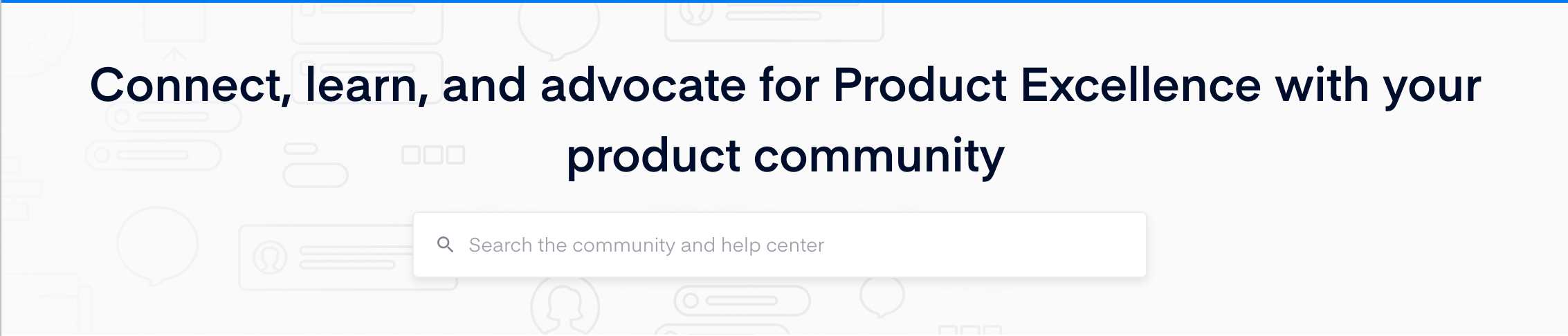
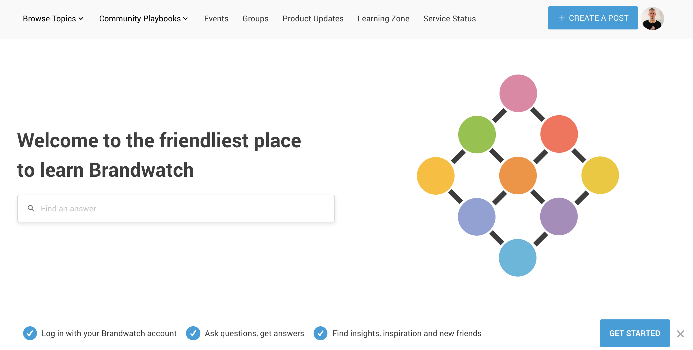
Here’s ours as it stands:


Thank you all in advance!

Congrats on the soon to be live! That’s gotta feel great!

I’m a fan of communicating the value with the heading. Ours looks like this:

Ideally for us, these would also be able to contain a tagline (hence my idea here)

I really like how DesignX does this: https://designx.community/

For me the the image in your example feels really large and wonder what it’s conveying to your audience.


This was the AirBnB example I referenced in the above idea request that explains the value.


Heya @Scott Baldwin - thanks for the kind words!

And I’ve voted on that idea, having a tagline would solve this problem entirely.

The image is gigantic in ours - and I’m not overly happy with it but it’s a low snag priority on my list! We really struggled with the way the hero banner scales at different break points for mobile devices. We ended up applying some custom CSS (never ideal) to change the way it works and align the text / search bar to the left. 
 

Love that Design X landing page also - loads of great value proof there.


Reply