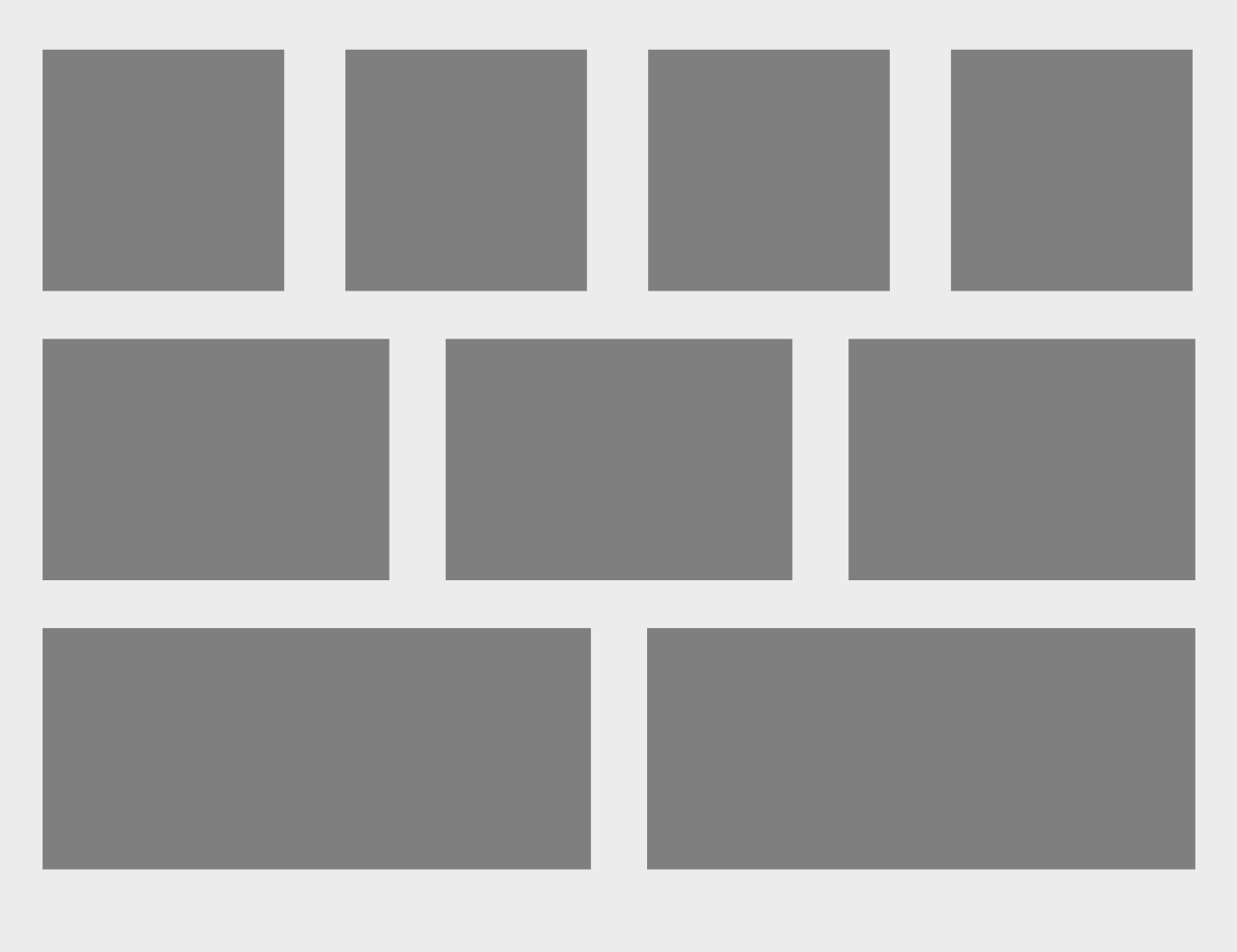
Is there some CSS we can use that would make featured topics automatically fill the width of the container (probably up to 4, max).
This would help us have the one widget and whether there are 2, 3, or 4 featured topics they’ll always show up properly without leaving gaps on the right side.
To be clear, something like this happening automatically:

Side note: this would be great for banners and quick links too. Overall, more flexibility in how all the widgets appear in terms of how many there are side by side. It would help break up monotony of there always being the same layouts :)
Thanks!

