Challenge: In my beta program group, it’s hard to identify what the latest beta programs are. Any new comment on a program that’s 4 months old comes to the top of the topic rollup.

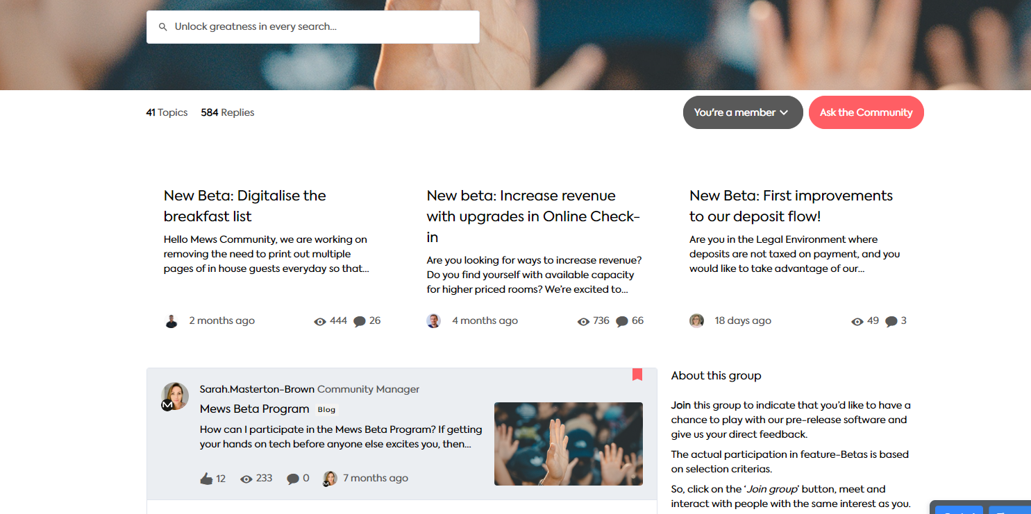
I want to clearly feature the latest programs on the group page. What I get (below) when I add these topics to be featured doesn’t look nice. They aren’t articles so don’t have images (the PM’s that create these topics don’t have admin access), and it could do with a title about the topics to call out ‘Latest programs’.

Has anyone figured a better way to do this. Or cld share some CSS for adding a heading to the featured topics section…? 🙏


First of all congratulations to the amazing response you have generated on your Beta program ins such a short period of time - whooooa!!

I cant think of another way @sarahmasterton-brown other than what you already have. Any other way of trying to go the Articles route would require the weight of being fancy be borne by the Community team (aka you?) ;) 

Standard Titles and keyword tagging is all we got.

Also curious you are featuring your Betas (this screenshot) in Public?


Thanks @anirbandutta Well, at least I was on the right track. Yes, our beta programs attract a lot of eyeballs. It is for public view currently but we are reviewing this.


Reply