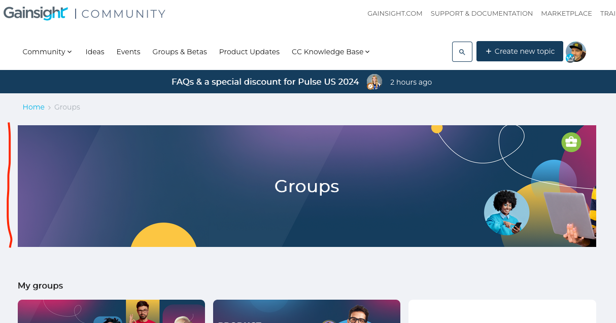
Here Gamechanger community is hero image in the Groups home page, how it is done? I can add hero image only to the group, not to the Groups home page.

Edit: Mods, please fix the typo in the title 😀
Mod edit: FIXED! :-D
Here Gamechanger community is hero image in the Groups home page, how it is done? I can add hero image only to the group, not to the Groups home page.

Edit: Mods, please fix the typo in the title 😀
Mod edit: FIXED! :-D
Best answer by Kenneth R
Hey
Here’s the code that you could use to achieve the same effect.
/* CSS for Events Header  */
.group-overview-wrapper-title{
background-image: url("https://insert_your_image_file_here.png");
  height: 240px;
  background-size: cover;
  align-items: center;
  justify-content: center;
  display:flex;
  margin-bottom: 32px;
  margin-top: 10px;
  color: white;
}
If you ever had a profile with us, there's no need to create another one.
Don't worry if your email address has since changed, or you can't remember your login, just let us know at community@gainsight.com and we'll help you get started from where you left.
Else, please continue with the registration below.
Enter your E-mail address. We'll send you an e-mail with instructions to reset your password.