
I think this possible based on @leo-inspired’s first comment here

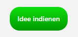
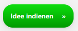
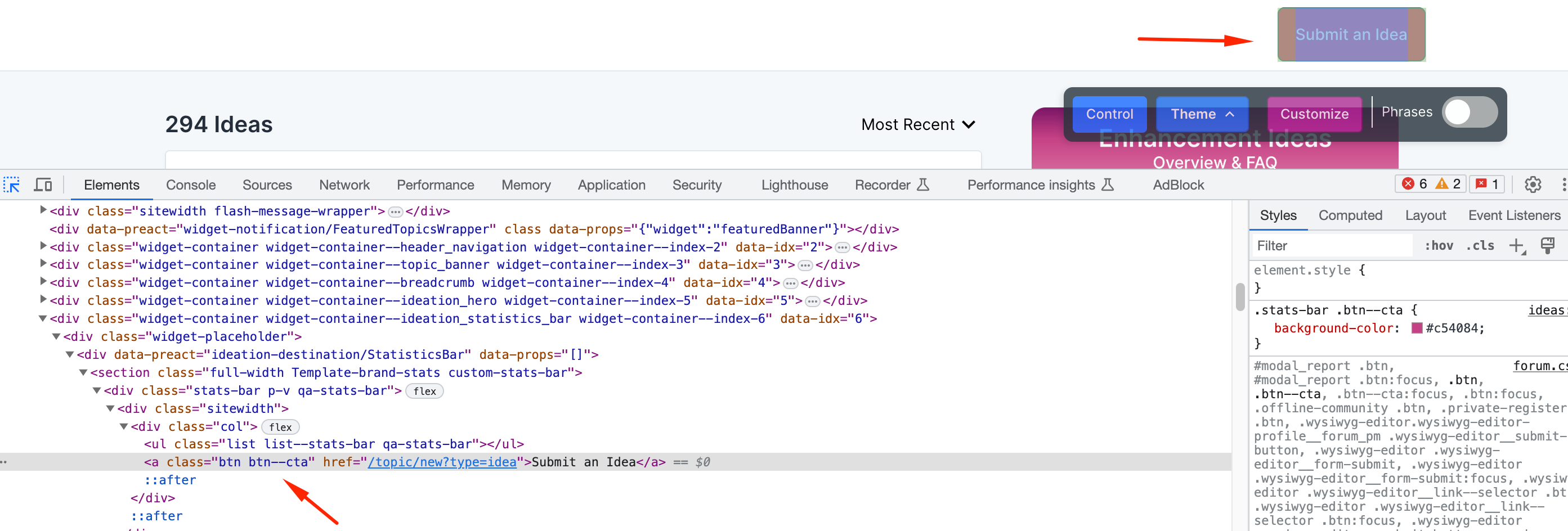
I’d like to change the background color for the Create an Idea button that comes via the ‘Create an Idea’ widget available when you customize the Ideation module landing page. 

The button uses default button styles (makes sense), but the color palette of that landing page would make it ideal for us to customize the color of just this button. 

Is this possible? If so, how? 

(i tried poking around with CSS, but couldn’t figure it out)

Hey @DannyPancratz, this should the job but I’m wondering if this class will change other buttons colors as well - let me know if that’s the case.

.btn--cta {
background-color: red;

}


Just as a quick suggestion, you can also create a HTML widget with a create idea button very easily just like this one in our community:


Hey @DannyPancratz 👋,

There’s a couple of ways to go about this and it depends how specific you need to be with the particular element you are trying to target.

If you’re confident that you you don’t use this class of element elsewhere in the community you can simply add a little bit more to the selector that @leo-inspired mentioned e.g.

.stats-bar .btn--cta {
background-color: red !important;
}

However, you could also use some Javascript to ensure that this styling is only applied on the Ideation module page. For example:

if (window.location.href == 'your ideation url') {
$('.stats-bar .btn--cta').css('background-color', 'red');
}

This would be less elegant (as you’d need to wait for the JavaScript to load once all of the other assets have loaded).


I made a HTML widget specifically for this button to make stand out.

hover


<a href="https://yourcommunity/topic/new?type=idea" class="btn--toggle-on" style="vertical-align:middle"><span>Idee indienen</span></a>
<style>
.btn--toggle-on:hover {
box-shadow: 0 2px 4px 0 rgba(0,0,0,0.08), 0 5px 20px 0 rgba(0,0,0,0.08);
background-color: #00aaff;
}
.btn--toggle-on {
margin-top:8px;
background-color: #0bbe0b;
background-image: linear-gradient(-180deg, #0dde0d, #009900);
}
.btn--toggle-on span {
cursor: pointer;
display: inline-block;
position: relative;
transition: 0.5s;
}

.btn--toggle-on span:after {
content: '0bb';
position: absolute;
opacity: 0;
top: 0;
right: -20px;
transition: 0.5s;
}

.btn--toggle-on:hover span {
padding-right: 25px;
}

.btn--toggle-on:hover span:after {
opacity: 1;
right: 0;
}
</style>


Thanks, everyone! I went with the CSS option from @leo-inspired & @olimarrio, but it’s good to have JS and HTML as a back up in the event I find this class used elsewhere or need a different approach. 


@olimarrio & @leo-inspired any tips on how to find that element via the Inspect console in my browser? I tried very hard to be self-sufficient yesterday, but couldn’t figure out how to get what I needed to target that element with CSS. 


Don’t worry @DannyPancratz, you’ll learn with time  - it took me a while to learn this, @olimarrio and @tom.shaddock helped me to master this art 🤖

For this button, you just need to make sure to target the whole div:

Google Chrome


Would you like a little exercise? I had one recent customer who asked me how to hide the Share button in the opening post. What would be the class for this element?


@DannyPancratz it’s all about learning how to use your CSS selectors well. You can see a list of all of the CSS selectors and how you can use them to target specific elements. Take the example that we are discussing:


Here, I wanted to make sure I was targeting only the CTA button that lives within the ‘Create an idea widget’, otherwise the styling would apply to all buttons with the class .btn--cta. So what I did was look for the class name that applies to the ‘Create an idea widget’, which was .stats-bar and then use the appropriate CSS selector to only target the elements that are a descendant of an element with this class.

Let me know if you have any more questions and we’ll be happy to help.


Reply