
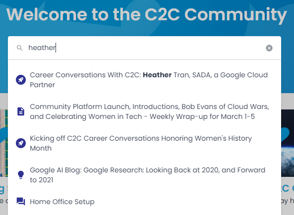
We began using the Product Updates module and content type last week. Our use case is a bit different, so we’ve used Phrases to change the term “Product Update” to match our brand and UX. 

When I searched, I noticed that Product Updates come with the rocket ship type icon like in the image below. The default icons for article, conversation, idea, etc work fine … but I’m wondering if it’s possible to change the rocket ship icon. Long term, our team might have interest in updating the the icons for the others as well. 

Is there an area to do this on the backend or how might we customize this? I didn’t see anything under customization, settings, or configuring Product Updates under platform. 

Also, how might I find where else these icons display on the platform? I know they show in Create topic and a few other places, but if I wanted to review how the styling works, what places should I look? 


@DannyPancratz very good one man! I want an answer to this too! Design team would be ecstatic. This feature would go nicely with the idea of custom content types… 

You’d be able to control both the default and custom content type icons! 


Bumping this one up in the activity feed, as it still needs an answer. 

This icon displays not only in search, but also when embedding a Product Update post within another topic on the community. 

@Jeanie Lee @Kenneth R @inSided CSM could one of you perhaps point this question in the right direction? 


Hey @DannyPancratz - am checking with the team.  There’s no standard way to update these as far as I know, but I wonder if it could be done via CSS.  Will let you know.


@Kenneth R I think the problem here is that the class used for all the icons is the same and the SVG path which defines the icon must come with the Algolia search results package… So while I could use CSS to hide the current icon and a background image for example to insert a new one, the result would be that all search results take on the same icon, even federated search results that have the external link icon. Overall I think the potential of CSS edits in the platform would be doubled if there were dynamic classes used more often. A good example of this is the category names in the feed that all have the same class, and could have had a dedicated class for each category created as well. My 2 cents! 


Example of what I am referring to:

/* TEST ICON CHANGE */
.algolia-hit-item--icon {
color: transparent;
background-image: url("data:image/svg+xml,%3Csvg xmlns='http://www.w3.org/2000/svg' viewBox='0 0 24 24' width='24' height='24'%3E%3Cpath fill='none' d='M0 0h24v24H0z'/%3E%3Cpath d='M12 2a9 9 0 0 1 9 9v7.5a3.5 3.5 0 0 1-6.39 1.976 2.999 2.999 0 0 1-5.223 0 3.5 3.5 0 0 1-6.382-1.783L3 18.499V11a9 9 0 0 1 9-9zm4 11h-2a2 2 0 0 1-3.995.15L10 13H8l.005.2a4 4 0 0 0 7.99 0L16 13zm-4-6a2 2 0 1 0 0 4 2 2 0 0 0 0-4z' fill='rgba(231,76,60,1)'/%3E%3C/svg%3E");
}

Result:


Hey @DannyPancratz - short update, and @SmartlyGreg - yes indeed you’re correct, they currently fall under a single CSS class, making it impossible to adjust them in this way.  And our Product team have confirmed that the icons are defined by us in the platform currently, with no way to change them.  Our Product team does agree that it’s a good suggestion to break these out into different classes so there are more options with CSS, so this is something they will consider.


@Kenneth R for the product team consideration, the categories issue I explained, is something I faced when I tried to add icons to the main categories of our community to help people identify them more easily. Sadly this requires heavy scripting too instead of just a custom CSS.

Hope this helps!


Reply