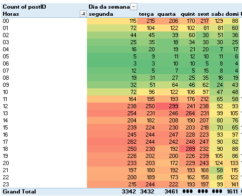
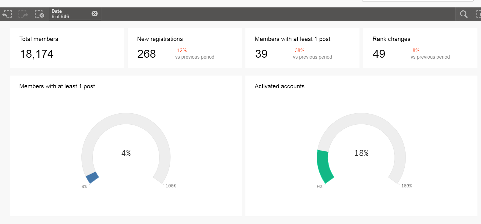
inSpired Community Analytics
Hi all!
During the inSpired event we announced our plans to release the first inSided Community Analytics dashboard.
With inSided Community Analytics we want to give you insights in the health and the performance of your community. We are aiming at providing you both with tactical, operational and strategical dashboards.
To make sure we can focus on building the best dashboards, we have decided to use an external BI solution, which we will integrate into our platform. A 3th party platform allows us to move faster and provide dashboards with a richer functionality.
Our aim is to deliver the first 2 dashboards in January 2018, and then continuously add more dashboards. All of our customers will automatically get access to these dashboards from within the Control environment. The first dashboards we will deliver are the Content and the Members dashboards. Next up in the planning we have a Community Success dashboard.
So what’s next?
We will start designing the next dashboards soon. We are expecting our community of customers will be the leading voice in deciding the dashboard themes.
Tell us in the comments which dashboard themes we should look at. Provide us with the KPI’s you want us to track, and the learnings you want to get out of them..
For example:
KPI: % of answers posted by community staff vs. % of answers posted by users
Why: I want to know if my community is activated, so if customers are helping each other or if staff engagement is still needed
Please also have a look at this ideation topic for a good example of a dashboard suggestion.
Sign up
If you ever had a profile with us, there's no need to create another one.
Don't worry if your email address has since changed, or you can't remember your login, just let us know at community@gainsight.com and we'll help you get started from where you left.
Else, please continue with the registration below.
Welcome to the Gainsight Community
Enter your E-mail address. We'll send you an e-mail with instructions to reset your password.


